Quanta Laboratories
A brand identity system and marketing site redesign for Quanta Labs, a B2B product testing laboratory, including a new color palette, typography, and graphic system.
Overview
One long scroll, with no visual identity to tie it together
I found this project through an internship. Quanta Laboratories, a B2B product testing lab, needed a marketing site redesign along with a cohesive brand identity to match.
The existing site had strong content, but it lived entirely on a single scrolling page, and there was no established design system, color palette, or typography to tie everything together.
An unlaunched redesign by another designer had also been developed, offering a useful reference point for what could be improved. My work drew from both versions, aiming to build a full five-page site with a cohesive brand identity behind it.
Research
Researching B2B practices, and what came before
Since most of my past design experience had been B2C, I started by researching how B2B UX differs before diving into the competitive analysis. This gave me a framework for what a B2B audience actually needs from a site, and what to look for once I started evaluating specific examples. Below are my findings on the distinctions between the two:
- More customers, lower value purchases
- Simpler, more intuitive interfaces
- Journeys stay similar across users
- Impulsive or emotional purchases
- Fewer customers, higher value purchases
- Denser interfaces built for more product info
- Journeys diverge by user role
- Long term, research-driven purchases
Competitive Analysis
Current Solutions
I then analyzed three existing B2B marketing sites. I took note of what information they prioritized, how they structured their pages, and what made each one feel credible and trustworthy to a business audience.
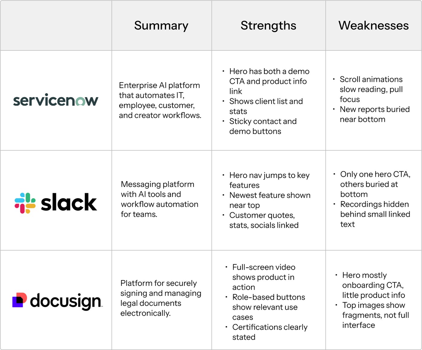
After analyzing, I noticed these pieces of information appearing consistently across all three:
- 1Lists of previous clients
- 2External reports, blogs, or articles
- 3Newest product features
- 4Product or company stats
With this in mind, I moved on to evaluating both the current Quanta Labs site and the unlaunched redesign against these same patterns.
Page Redesigns
Rebuilding the site, page by page
For each page, I referenced my UX research to stay grounded in B2B practices, while still building on what already worked in the unlaunched redesign rather than starting over completely.
Below is a page by page look at the specific issues I identified in that draft, shown alongside the sketches that addressed them.
Home Page
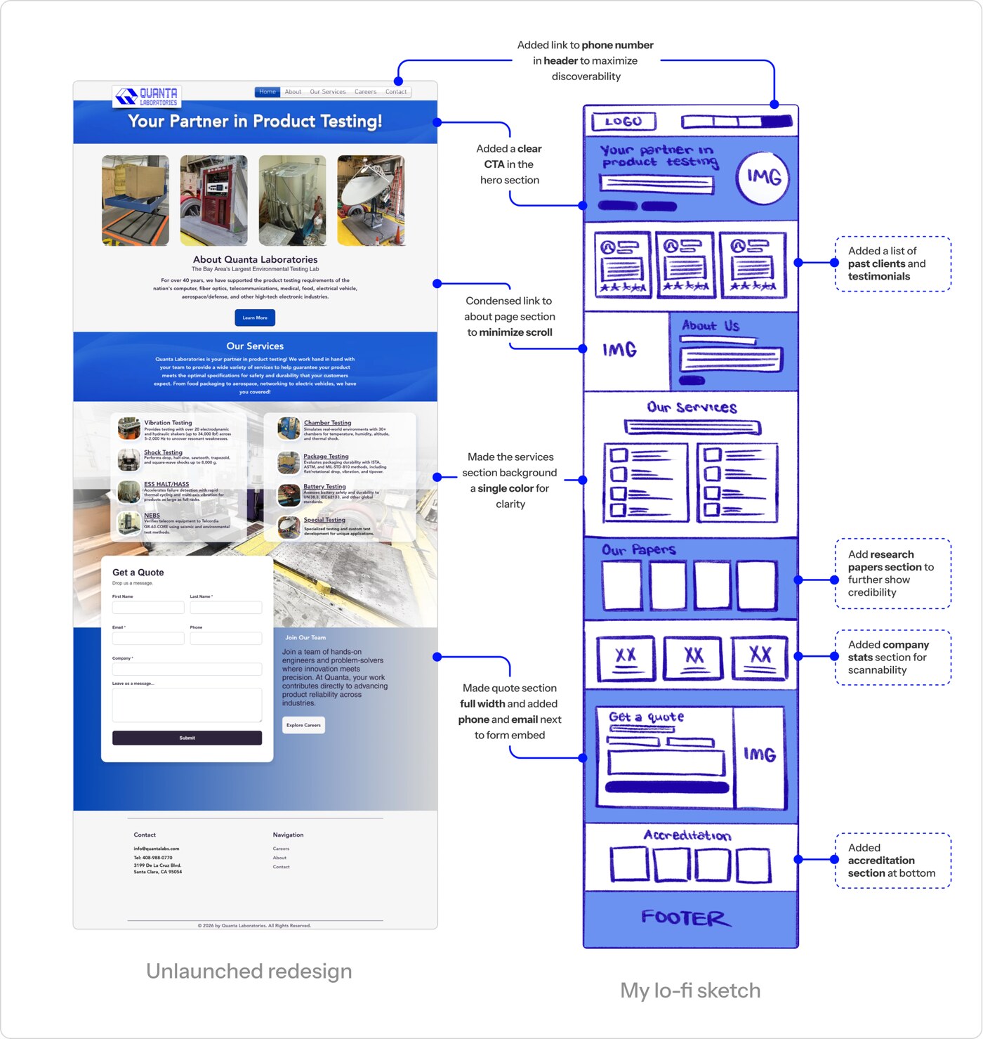
The homepage draft was missing an accreditation section entirely, along with any customer testimonials or supporting credibility documents like research papers or stats, things a B2B audience tends to look for before trusting a new company. The hero section also had no clear call to action, and large chunks of text throughout made the page hard to scan quickly.
I sketched a version that led with a clear CTA in the hero, broke up dense text into scannable sections, and added the accreditation, testimonials, and credibility content the draft was missing.
About Page
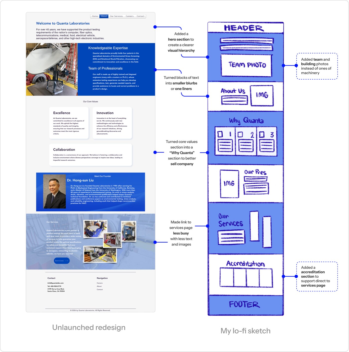
The about page draft relied heavily on large chunks of text, with few images to actually show what Quanta Laboratories does or looks like in practice. It was also missing a clear "why Quanta" section, something that could help answer the questions a potential client might have before reaching out.
I sketched a version that broke up the text with more visual support and gave the page a clearer point of view on why Quanta stood out.
Services Page
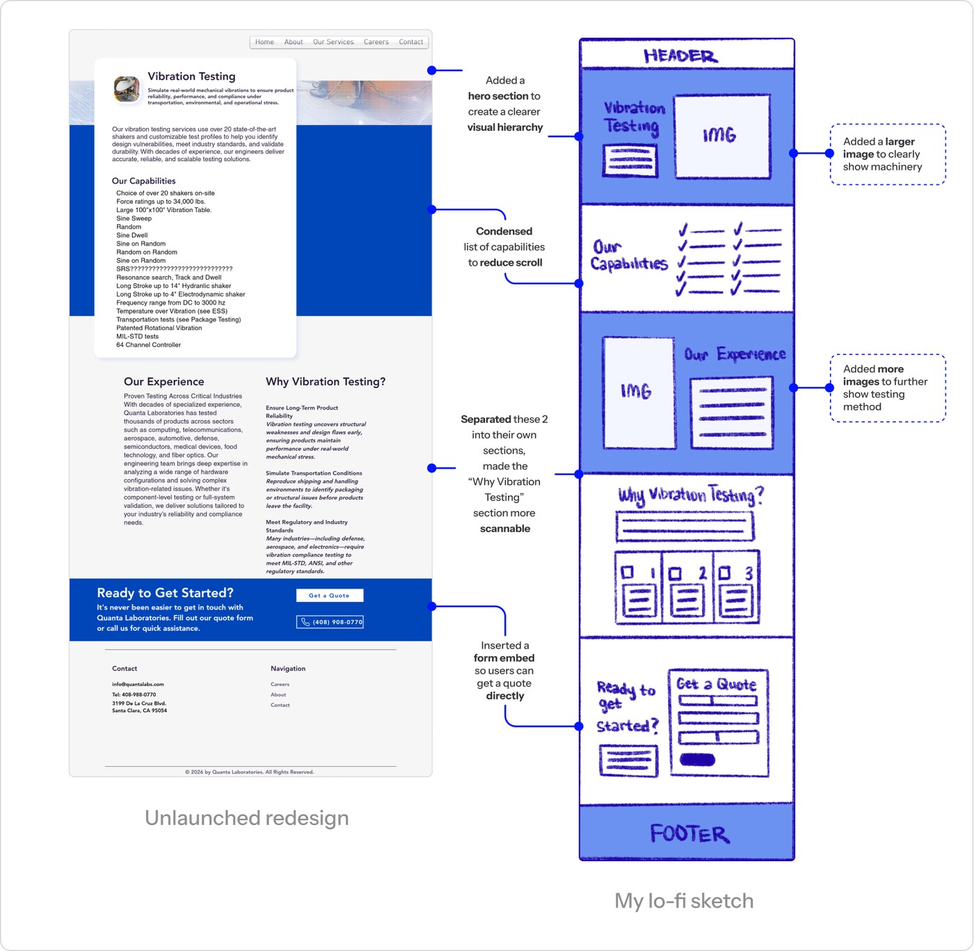
The services page draft was dense with walls of text, much of it repeating information already covered elsewhere on the site. This made it hard to scan and understand what Quanta actually offered without reading closely.
I focused my sketches on cutting the redundancy and restructuring the content so someone could scan the page and understand the services at a glance.
Careers Page
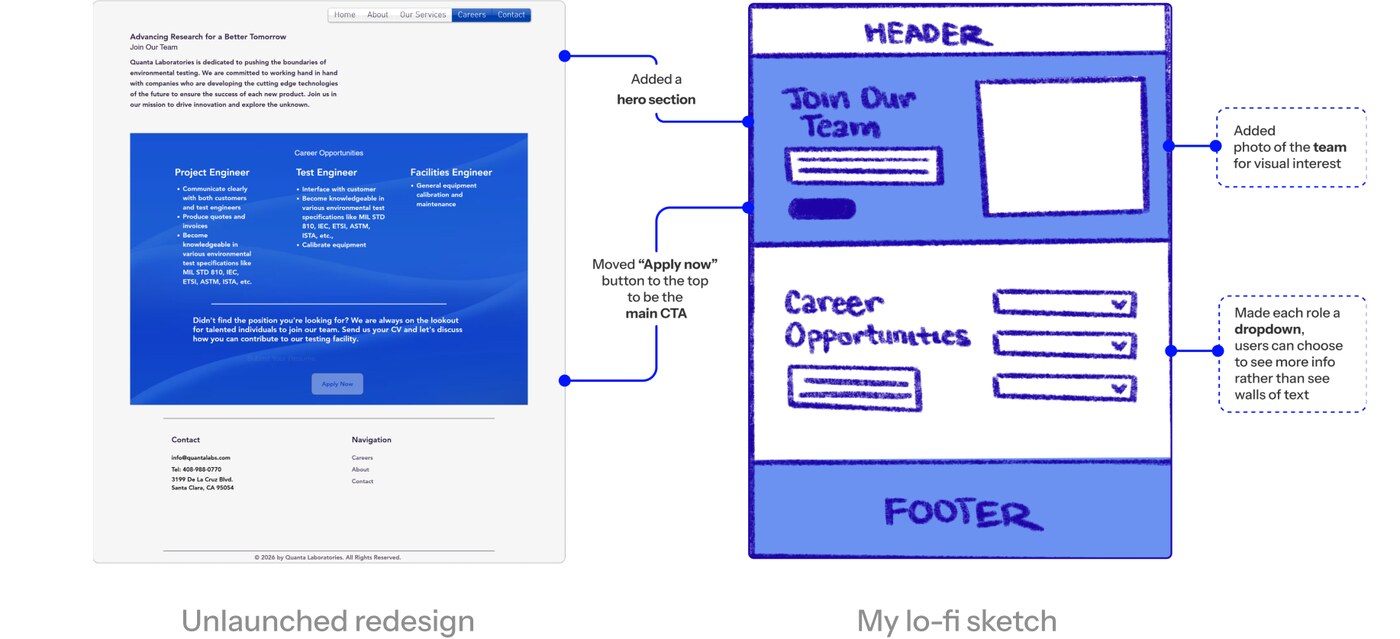
The careers page draft was another page with heavy walls of text, and its "Apply Now" button was buried at the bottom, easy to miss for anyone actually looking to apply. Different roles were also hard to scan through as a list.
I sketched a version that moved the "Apply Now" button higher on the page and turned each role into a dropdown, so roles could be scanned at a glance without defaulting to a wall of text.
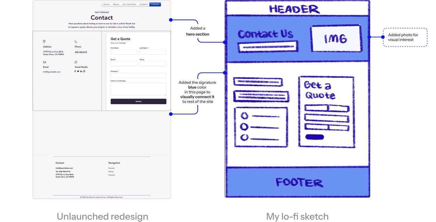
Contact Page
The contact page's content was solid, the main issue was visual. Its identity didn't match the rest of the site, making it feel disconnected from the pages around it.
My sketches focused less on restructuring content and more on bringing the page's visual language in line with the rest of the site.
Visual Identity
Establishing Branding
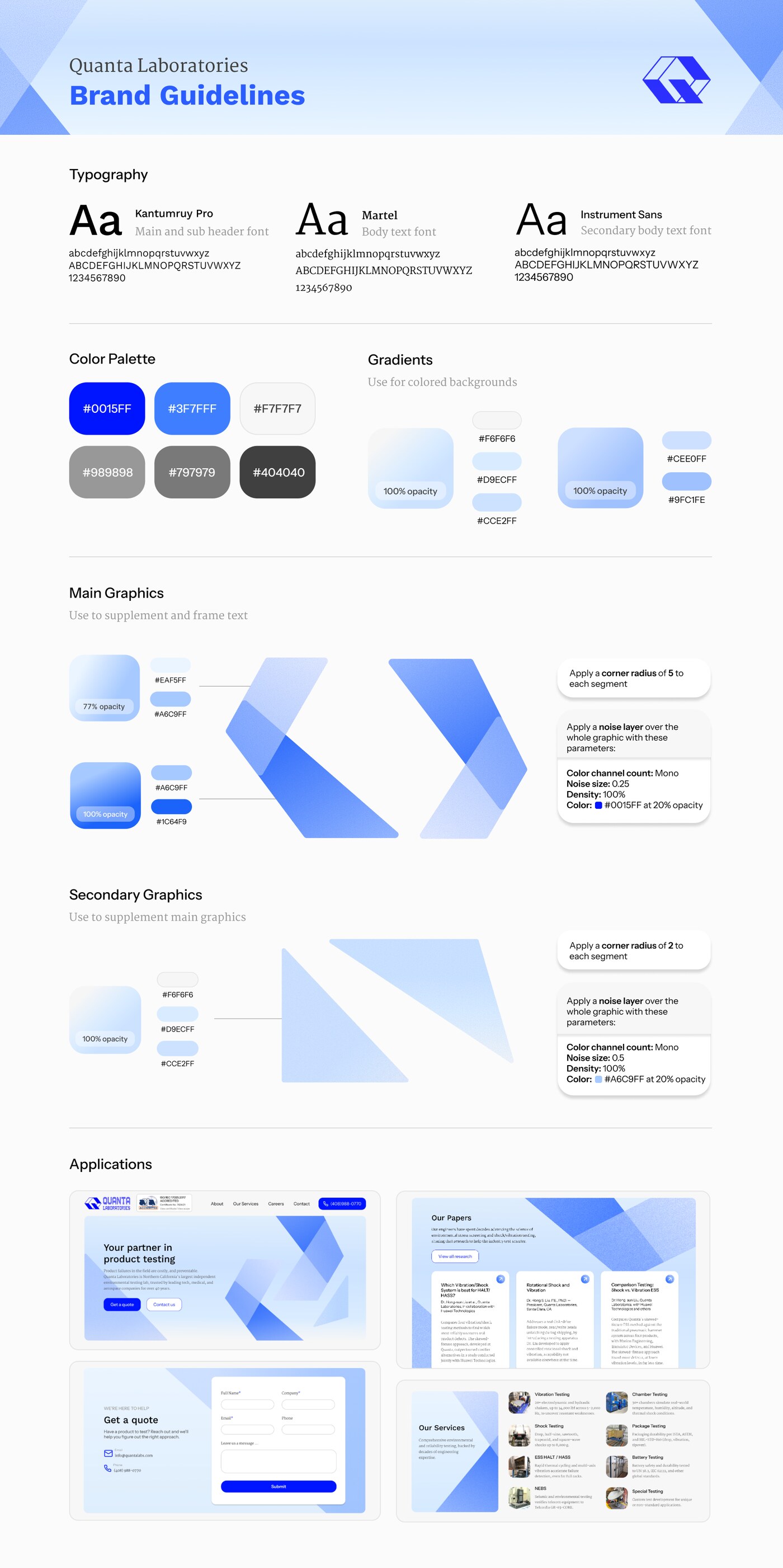
Everything in the visual identity was built outward from Quanta's existing logo, the abstracted Q. I pulled the same colors and shape language directly from it, translating that into a simple system of angular and rectangular shapes used to frame and supplement text throughout the site.
The color palette followed the same logic, a range of blues with neutrals grounded in the logo's existing colors rather than something introduced from scratch. For typography, I looked at previous website designs to keep continuity with Quanta's established identity, choosing fonts that stayed true to that while still fitting naturally into the new visual system.
I compiled this visual branding into a brand guide sheet for future designers to reference, keeping it easy to understand and quick to scan.
Full Branding Guide
Final Solution
The Quanta Laboratories Website, redesigned
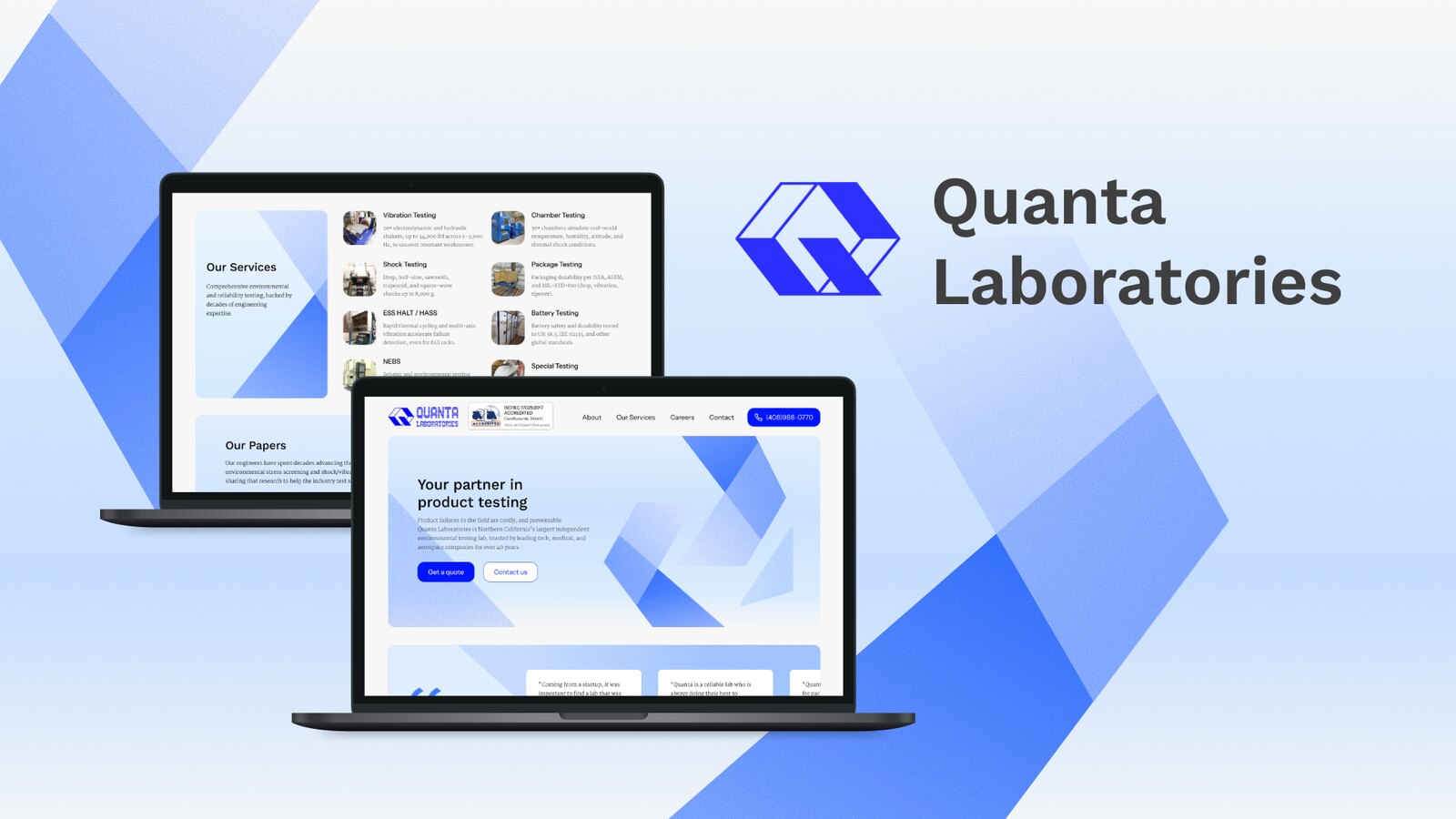
The final site brings all five pages together, Home, About, Services, Careers, and Contact, in a desktop-first layout designed around credibility, scannability, and clarity.
Home
Rebuilt the homepage with a clear hero CTA, an accreditation section, testimonials, and credibility content, organized for easy scanning.
About
Broke up dense text with supporting imagery and added a "why Quanta" section to give visitors a clearer sense of the company.
Services
Cut redundant content and restructured the page so services are scannable at a glance rather than buried in text.
Careers
Surfaced the "Apply Now" button higher on the page and restructured role listings to be more concise.
Contact
Realigned the page's visual identity with the rest of the site while keeping its existing content intact.
Reflection
Notes & Takeaways
Working on Quanta Labs introduced me to both a new audience and a new kind of design process, one built around redesigning rather than starting fresh.
Learning to
design for B2B
This was my first time working with B2B UX, and it taught me a lot about how different it is from B2C. I had to design for an audience I hadn't really considered before, which changed how I approached presenting the company throughout the site.
Redesigning, not
starting from zero
This was also my first time redesigning an existing solution rather than building something from scratch. Having something to reference and build around came with its own constraints, and it taught me how to balance originality with staying true to what was already there.