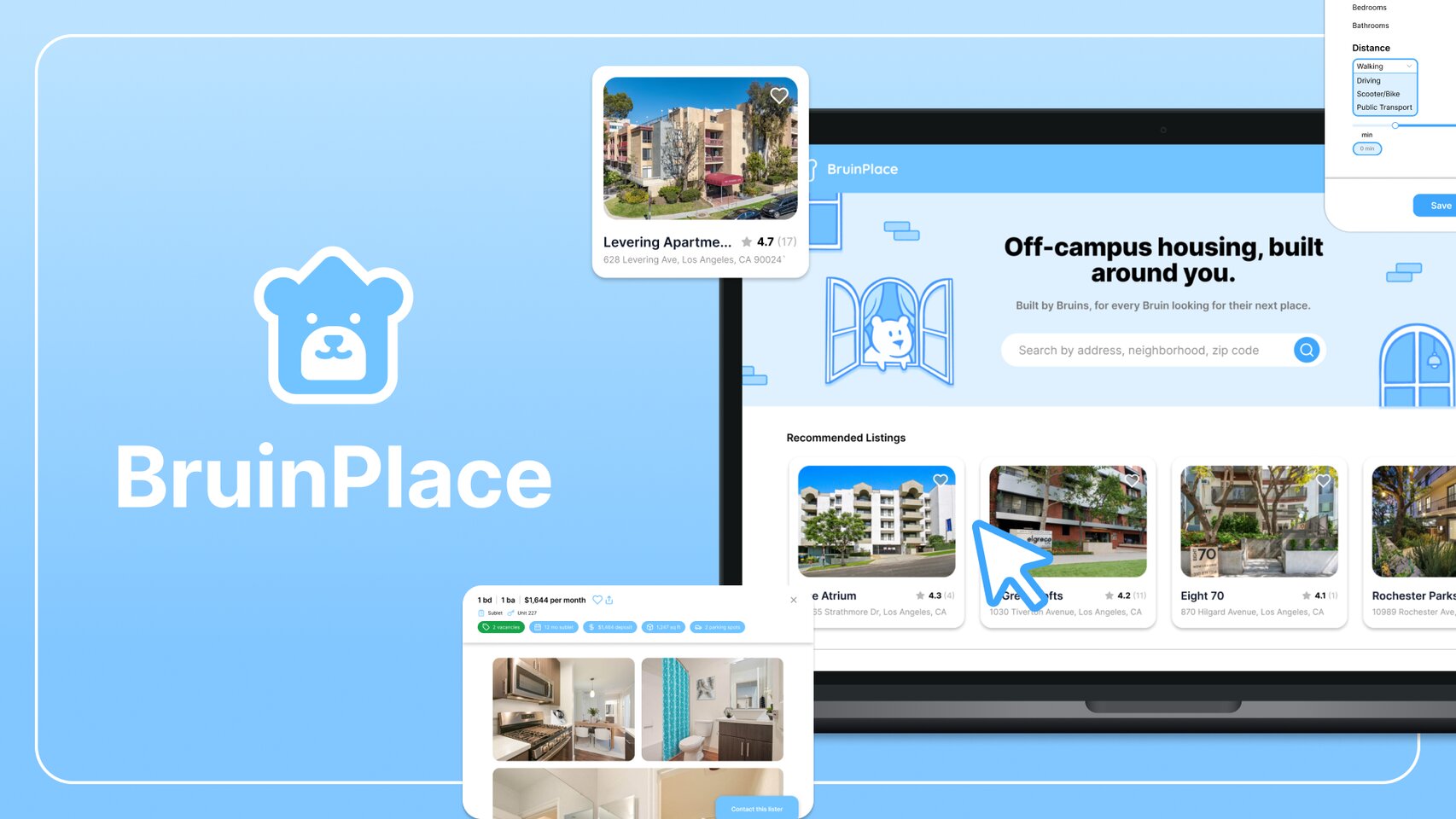
BruinPlace
A UCLA-only housing marketplace that centralizes apartment, sublet, and lease takeover listings for Bruins — cutting through the noise of group chats and generic rental platforms.
Problem
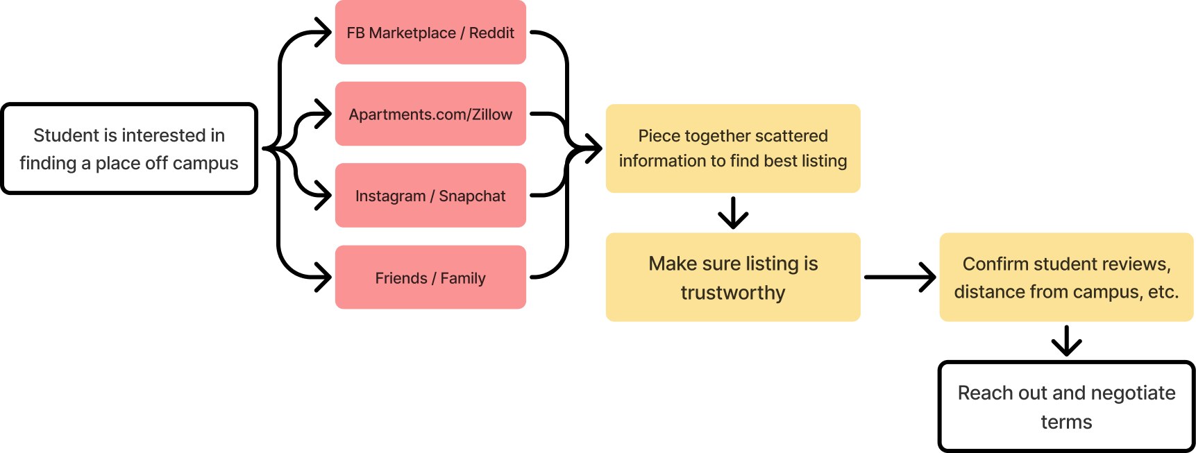
Finding housing near campus is a long and scattered process.
Currently, for students to find off-campus housing, they first need to go through a complex and unorganized process of sifting through dozens of platforms or relying on word-of-mouth. Even after this search, because of a lack of trustworthiness and legitimacy, finding somewhere to live is not guaranteed. BruinPlace aims to serve as an all-in-one platform for students, simplifying and streamlining this housing search process.
Research
Student Pain Points
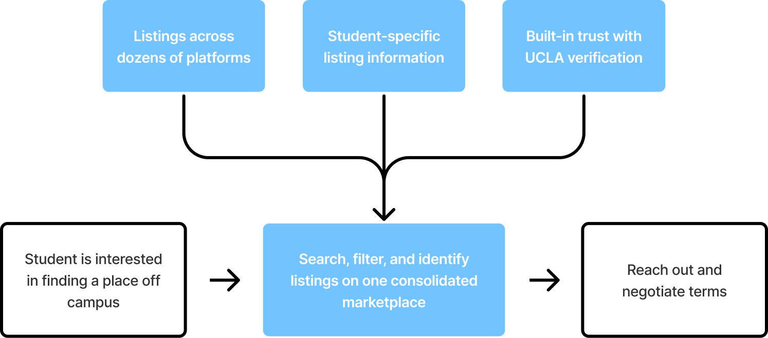
After 30+ user interviews and 100+ survey responses, three main issues with this current process stuck out:
- 1 Listing information doesn't account for student needs.
- 2 Need to navigate dozens of platforms to see all options.
- 3 Lack of trustworthiness for listings and posters.
Our design process centers around these three issues, making the housing journey more manageable.
Competitive Analysis
Current Solutions
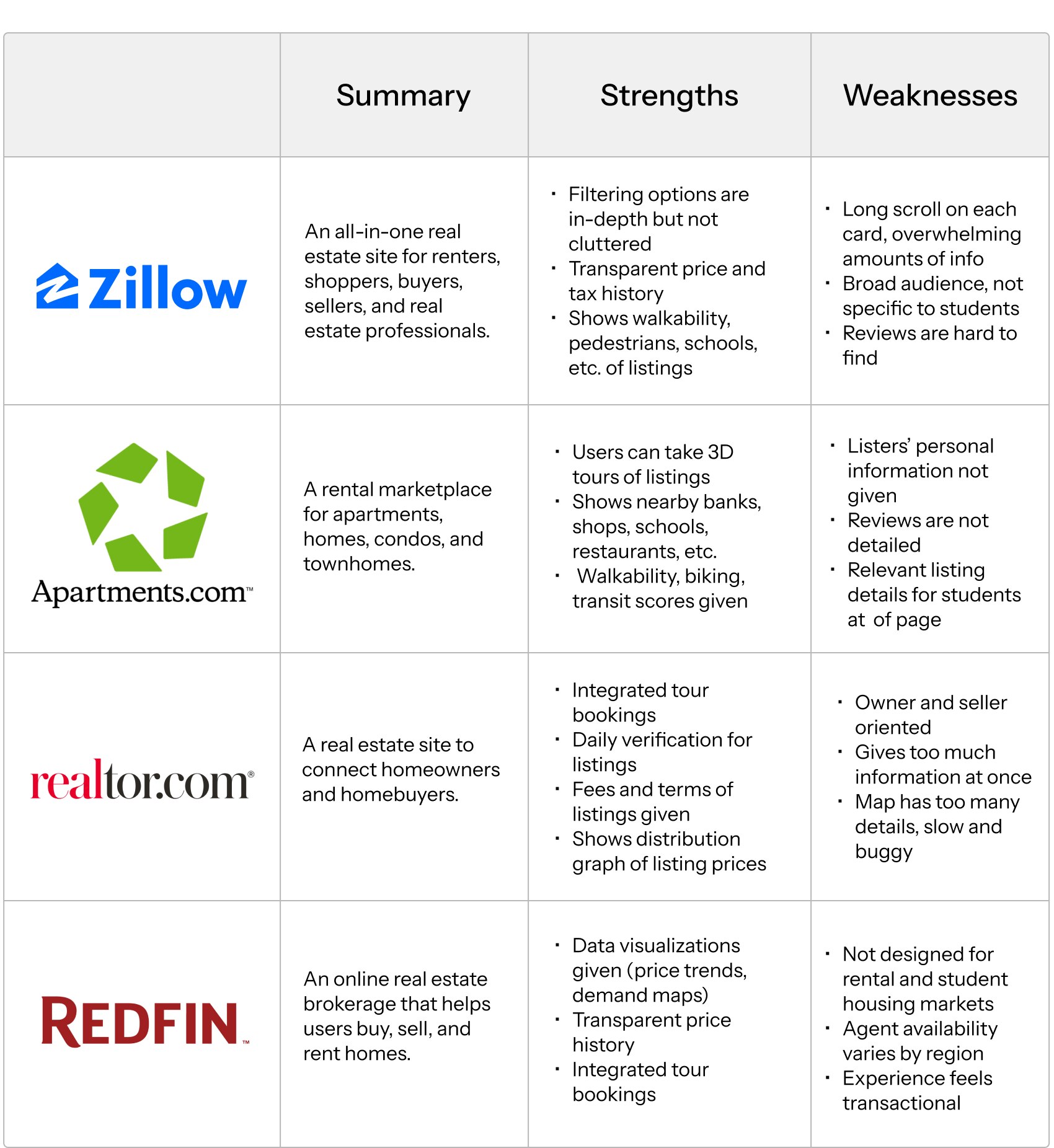
We first analyzed the current housing website solutions. I took note of target audiences, features that would appeal to students, and how useful the platforms actually are for students looking for housing from a practical standpoint.
User Flow
Mapping the experience
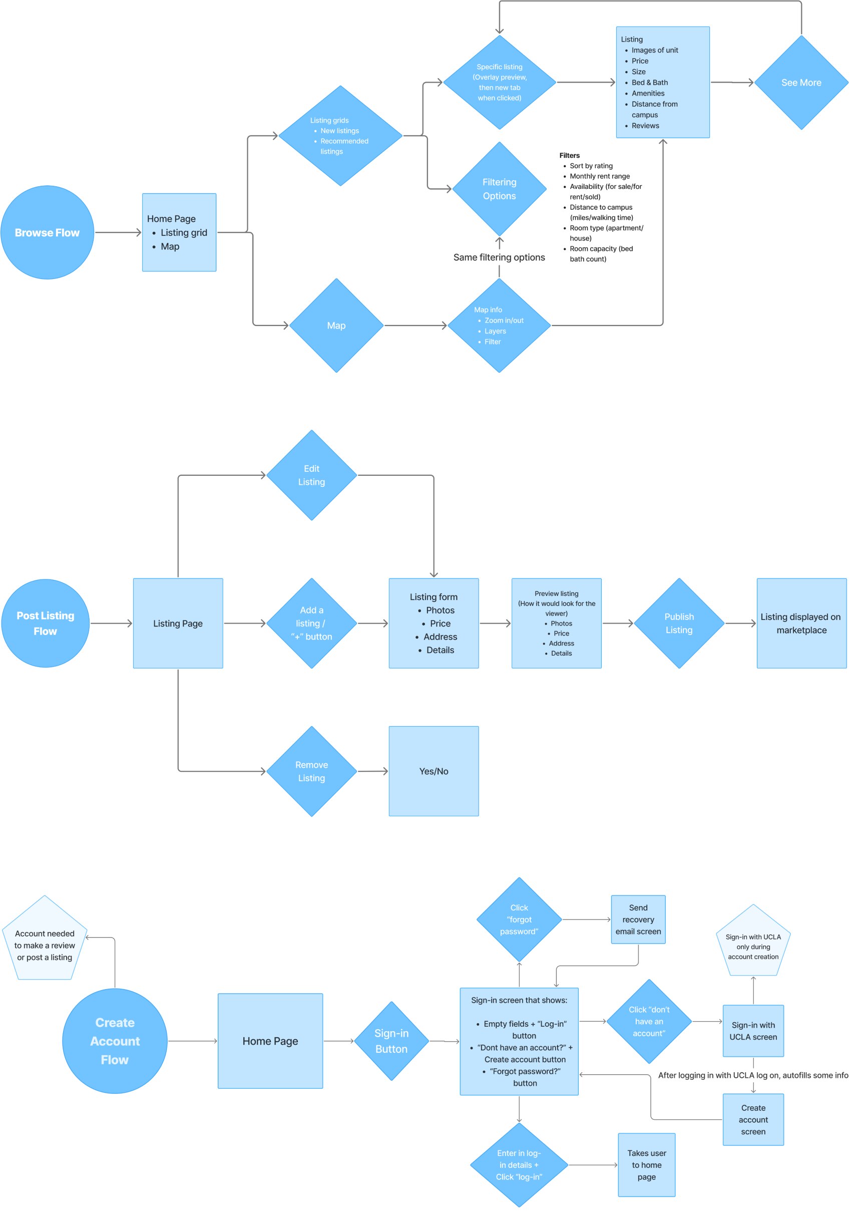
As a team, we started our design process by creating user journey charts for the key features we wanted to implement. This is when we narrowed down which filtering options, listing details, review details, and verification systems would best serve a student audience.
Low Fidelity Designs
Early Versions
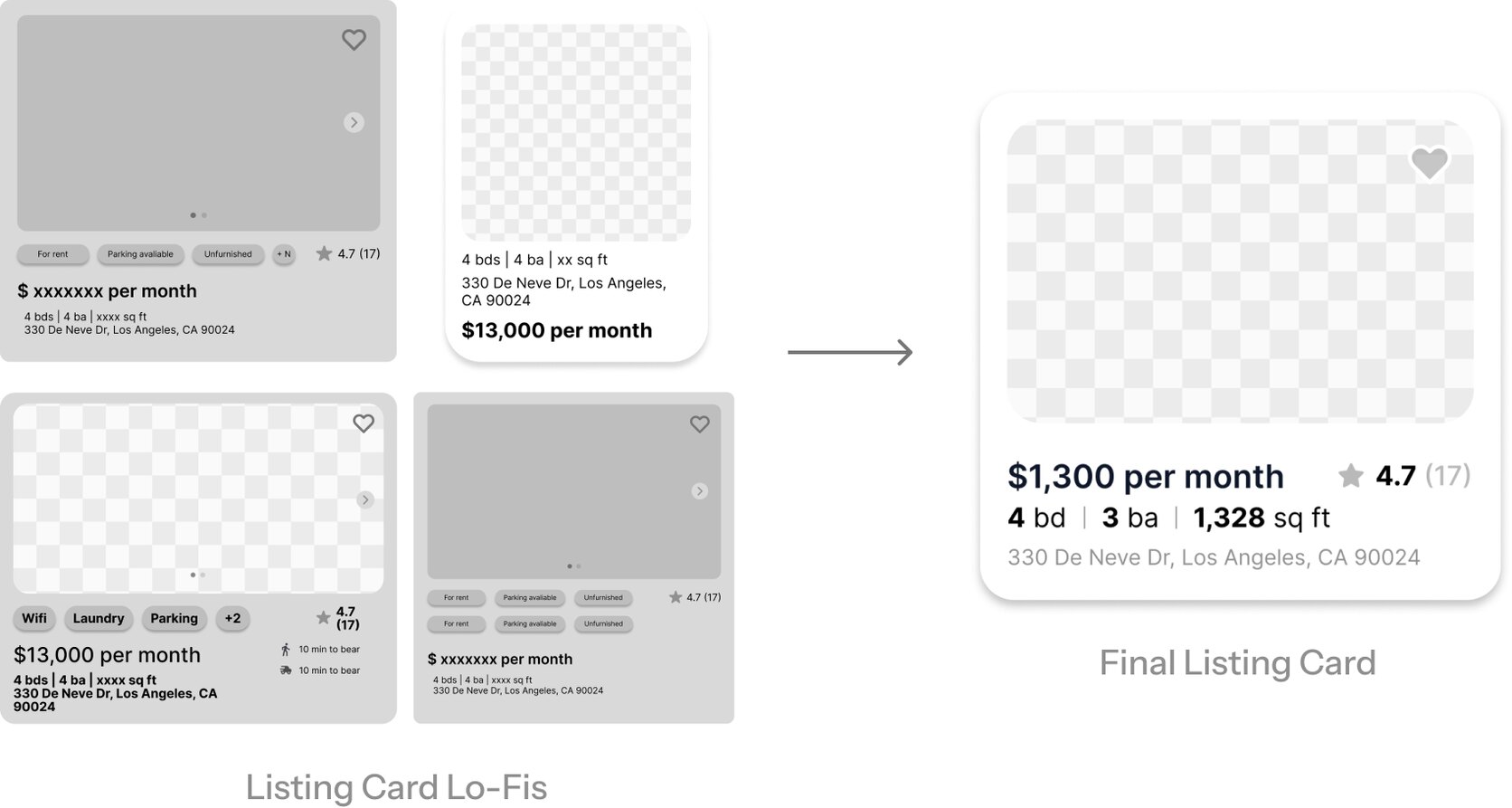
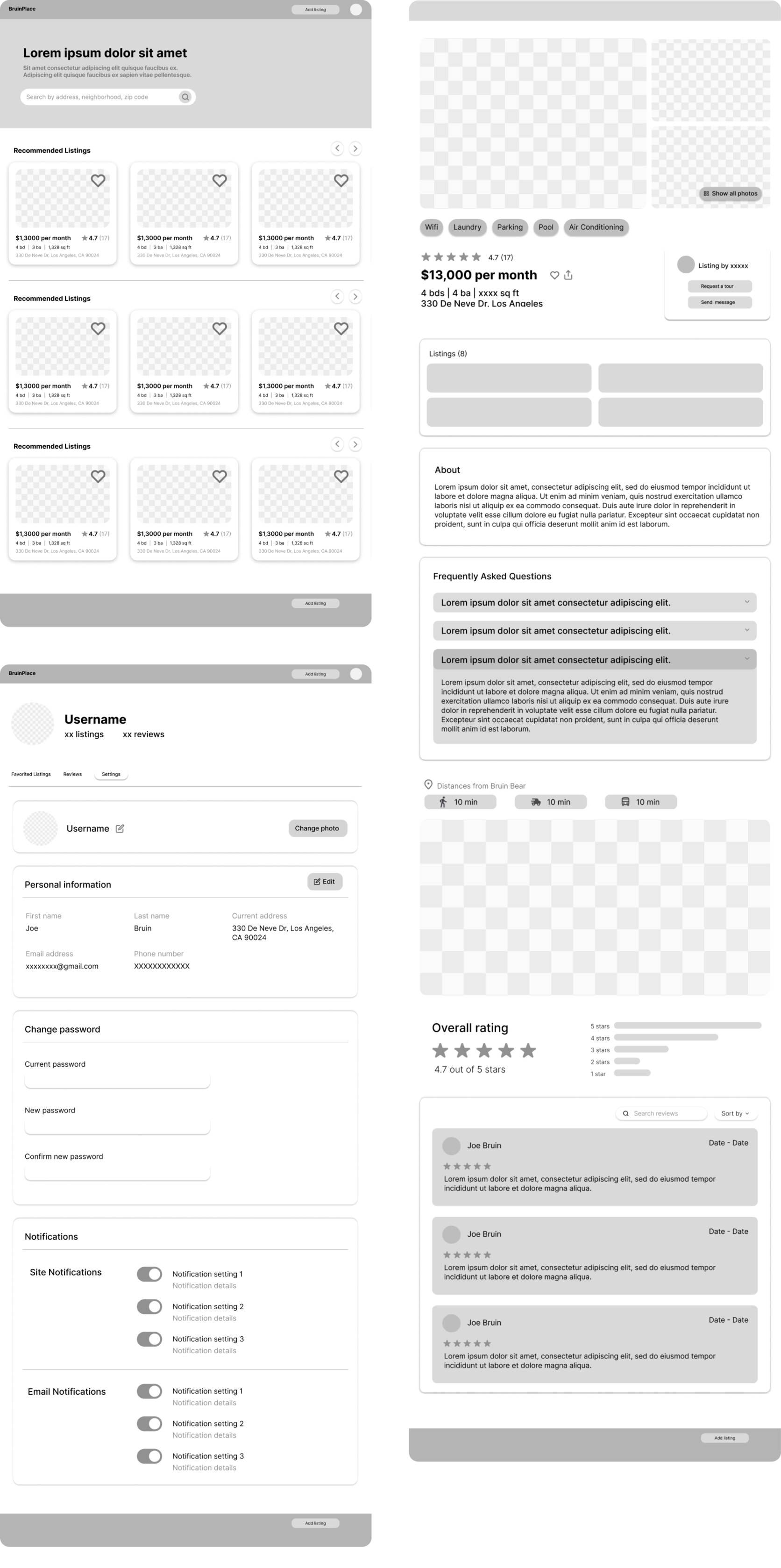
For our low fidelity designs, we did several iterations of key screens as well as the housing listing cards that appear across several interfaces. We decided on a minimalist and clean style, focusing on making the site intuitive and straightforward while presenting lots of information without being overwhelming. I worked on the landing, housing listing, and profile pages as well as the housing listing cards.
Housing Listing Card Iterations
Key Lo-Fi Screens
Visual Identity
Design System and Branding
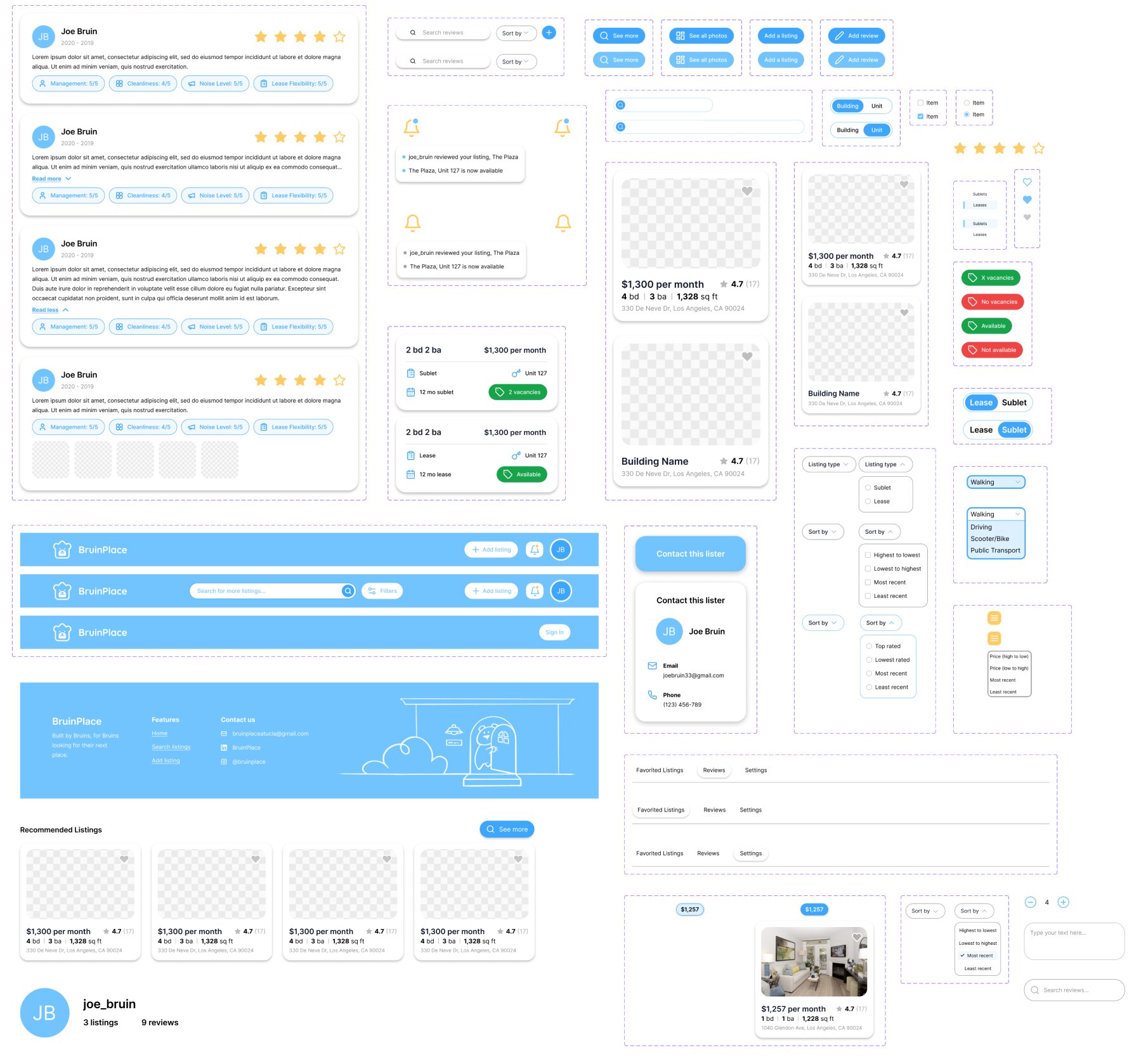
Our developers requested our team to use the ShadCN UI toolkit. Using the pre-made assets, we edited and customized them so it fit our branding and remained consistent across screens. I helped flesh out key elements of our design system such as the header, footer, housing listing cards, drop-down menus, and various other elements.
Design System Elements
Branding Elements
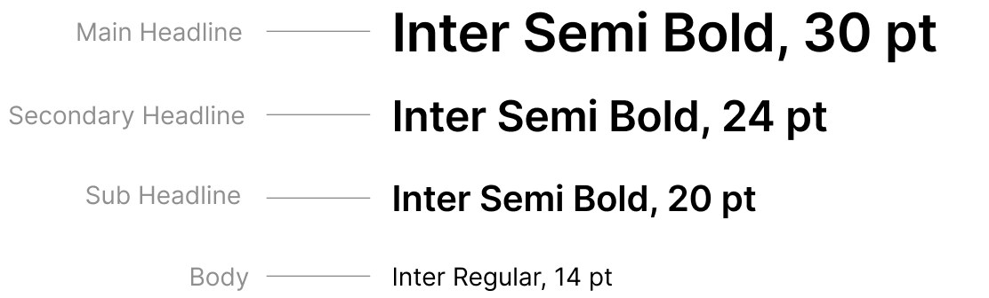
For the branding, I first collaborated with my team to decide on colors and typography. We settled on a UCLA inspired color palette with a sans-serif font to further develop a clean visual style while staying student-focused.
Colors
Typography
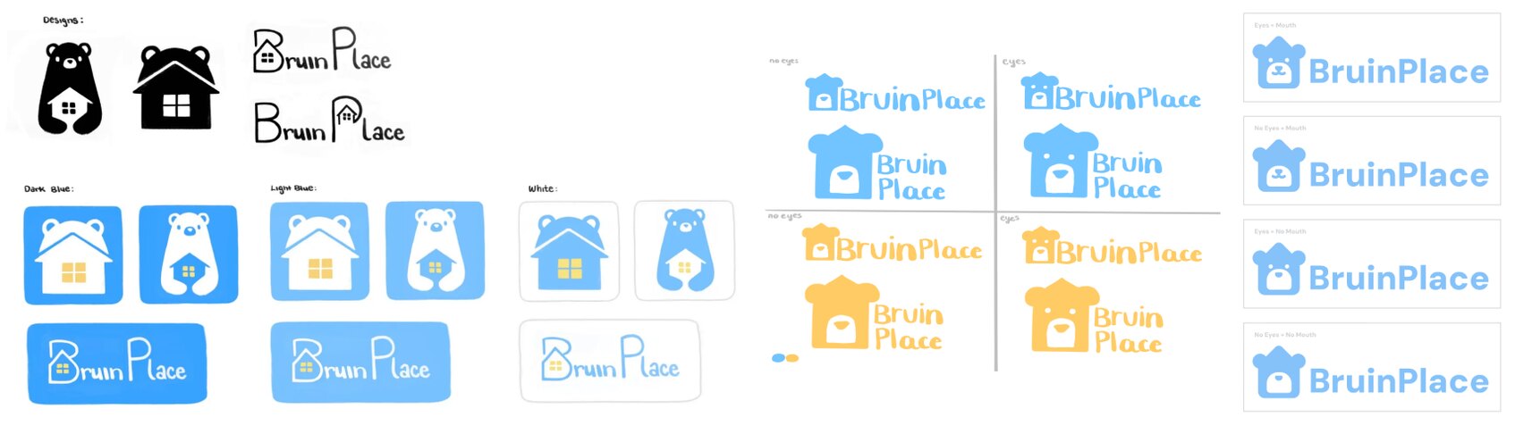
I then worked with another designer to build our logo. We created several concept sketches and presented them to the rest of our team for feedback, eventually landing on the minimalist bruin house logo.

I also created a few illustrations based on the brand colors and logo we decided on that were later used for the landing page, social media, and pitch slides.

User Testing
Testing with Bruins
For testing our iterated designs, we conducted user testing with various UCLA students to see if our screens were easily navigable and cohesive. I gave 5 participants our Figma prototype along with a list of tasks to complete while I observe how they navigate through our designs. The results of my user testing are listed below:
Changes Made
The split-screen search interface had low discoverability, users primarily found listings through the landing page
Made the split search screen easy accessible in the header
There was confusion on what the difference was between a building listing and a unit listing
Added toggles to separate building and unit listings in the search screen and favorited listings tab, replacing a combined view
The “Highest to Lowest” / “Lowest to Highest” filtering option was mistaken for price, not rating
The “Highest to Lowest” / “Lowest to Highest” filtering option was changed to “Top Rated” / “Lowest Rated”
Final Solution
The housing search, redesigned
The site focuses on three core flows: browsing listings, posting listings, and leaving building reviews with a desktop-first layout built around trust signals and student-specific filters.
Landing Page
Search by neighborhood, price, or building name to jump straight into results, with suggested listings surfaced below based on your activity.
Split Screen Search
Toggle between buildings and units, apply student-specific filters, and cross-reference an interactive price map with listing cards side by side.
Housing Listings
Browse key details like distance from campus, amenities, and lister info, then read student reviews or check available units before reaching out.
User Profiles
Save listings you're interested in, view reviews you've left, and manage account settings — verified through your UCLA email.
Reflection
Notes & Takeaways
BruinPlace was my first complete UX project from start to finish, and it ended up teaching me more about the full design process than anything before it.
Learning the
full process
I got to work on nearly every part of a design project for the first time, from the design system and branding to prototyping, user flows, competitive analysis, and user testing. Having a hand in all of it gave me a much clearer picture of how each piece connects to the next.
Problem solving
through design
This was the project that taught me how to actually problem solve through UI and UX rather than just execute a look. Designing with a specific audience in mind changed how I approached decisions, since every choice had to serve UCLA students specifically rather than a general user.