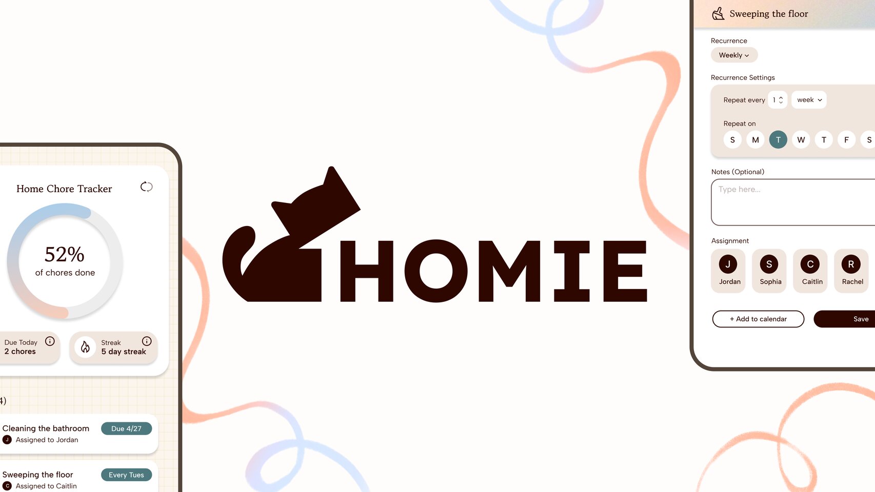
Homie
A mobile app that gives college roommates a shared home base for chores, groceries, pantry tracking, and scheduling — all in one place.
Problem
Managing a shared living space shouldn't require 5 different apps.
Currently, managing a shared living space means juggling separate apps for chores, groceries, and scheduling on top of endless group chat threads. Without a dedicated system, miscommunication and dropped responsibilities make roommate conflicts more likely. Homie aims to bring all of these logistics into one shared space, purpose-built for the way college roommates actually live.
Research
User Pain Points
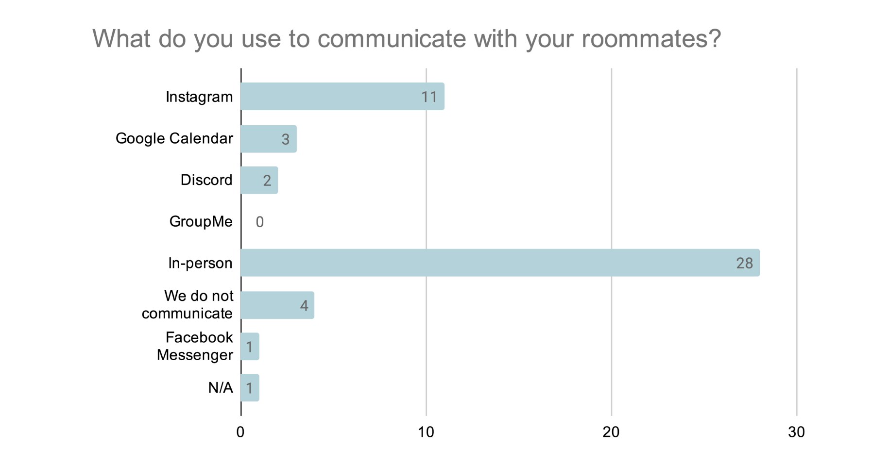
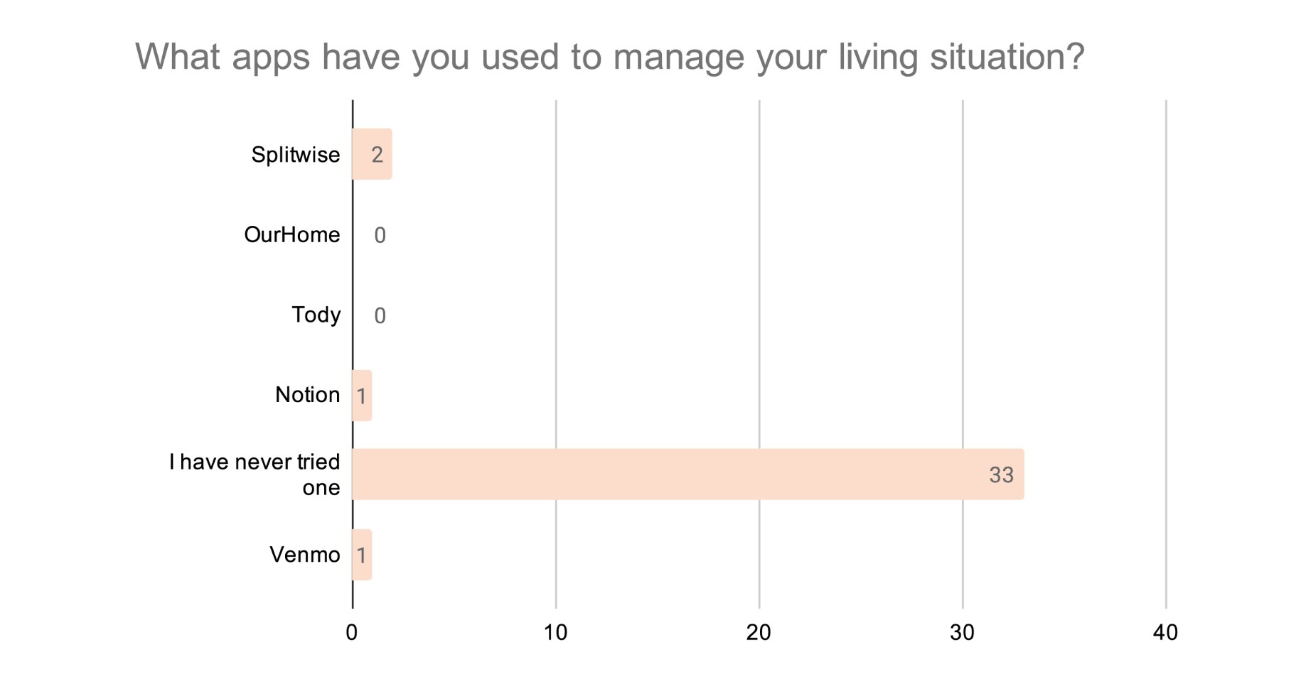
After 35+ survey responses, three main data points stuck out:
- 1 91.7% of responses reported they have never used an app to help manage their living situations
- 2 41.6% of responses reported that a chore system would be useful in their living situation
- 3 Common complaints included communication issues, chore accountability, and scheduling difficulties
Keeping these points in mind, we designed Homie for roommates to organize all household logistics in one place that creates a space for accountability and clear management.
Competitive Analysis
Current Solutions
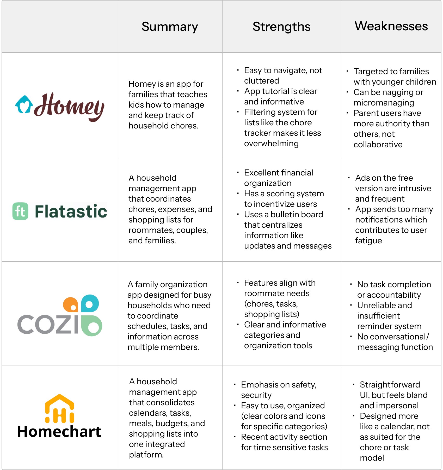
We audited existing household management apps to identify what was built for roommates specifically versus families or children, and to surface features worth carrying into Homie.
User Personas
Who we designed for
We each developed a user persona grounded in a realistic college living situation. I mapped out who they are, what their day-to-day looks like, and what's actually driving their frustration with shared living to keep our design decisions anchored to real needs.
Joseph Burn
Demographics: 21-year old UCLA student, works as a news editor, from Glendale
Their situation: 3 classes a day on average + 12 hours of work each week, goes home on the weekends but is told to do more than half his share of chores, 4 forgetful housemates
Root of their problem: Poor communication & accountability
What they want to improve: Better chore consistency & distribution
Joe Bruin
Demographics: 20-year old UCLA student, from the bay area
Their situation: 1-2 classes a day, comes home late due to extracurriculars, has 4 housemates he isn't familiar with, chores are done usually regularly but individually
Root of their problem: Lack of community & collaboration
What they want to improve: Better communication & sense of community
Jolyne Cujoh
Demographics: 20-year old UCLA student, from Orange County
Their situation: 2-3 classes per day, spends a lot of time in the apartment, has 3 other housemates who don't, dirty space & spoiled food due to roommates not being present
Root of their problem: Lack of awareness & accountability, not a confrontational person
What they want to improve: Reminders to clean and watch for food spoils
Julia Shaw
Demographics: 27-year old UCLA graduate student, from Irvine
Their situation: Has 1 housemate who they are friendly with and split responsibilities evenly, both have busy schedules that don't leave room for open communication
Root of their problem: Scheduling & task management
What they want to improve: A system for shopping, finance, & responsibility allocation
Low Fidelity Designs
Early Versions
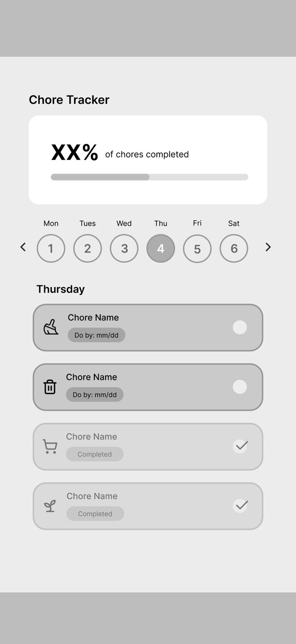
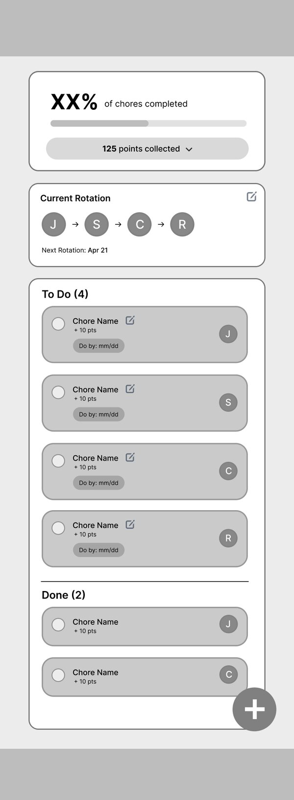
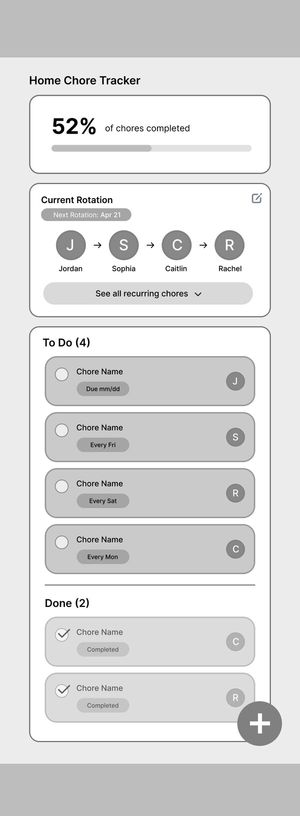
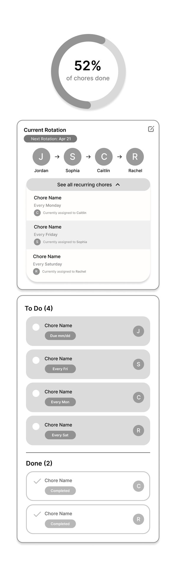
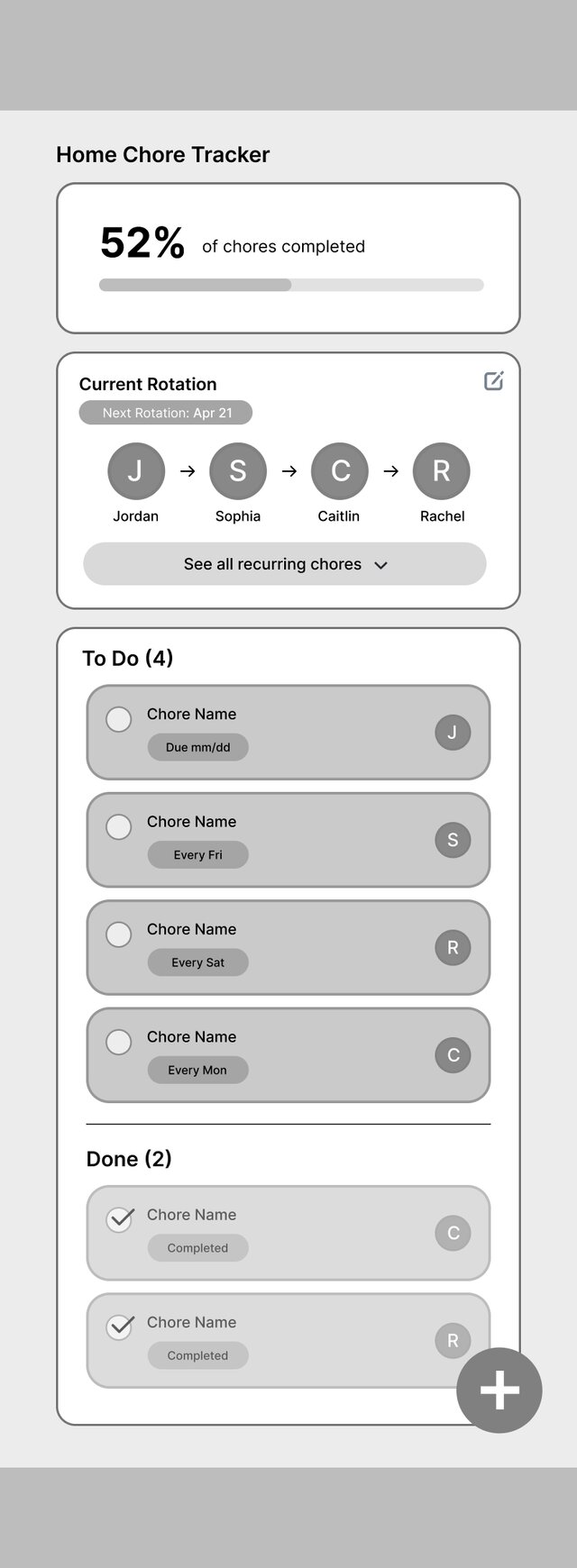
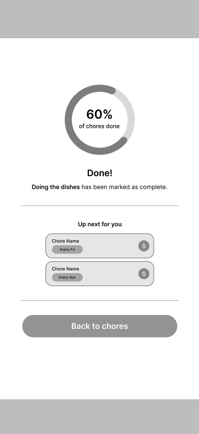
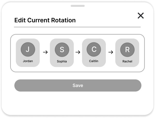
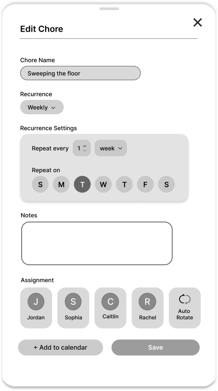
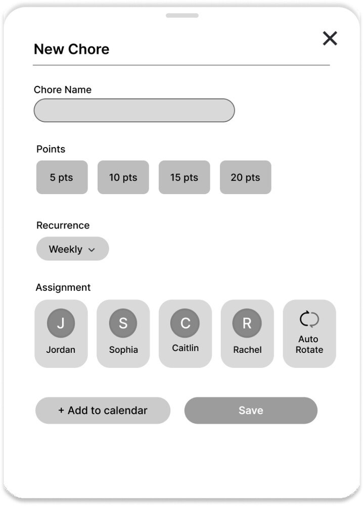
For the low fidelity designs, I did several iterations of the main chore tracker screen, prioritizing readability, conciseness, and clarity. I also drafted out possible pull up menu layouts for the additional chore tracker screens that would appear for creating, editing, and completing chores. This was also when we thought through product direction, such as user incentives like point systems. We later scrapped this idea as it introduced a layer of gamification that felt misaligned with the app's straightforward, low-friction tone.
Main Chore Tracker Screen Iterations
Key Lo-Fi Screens
Visual Identity
Branding
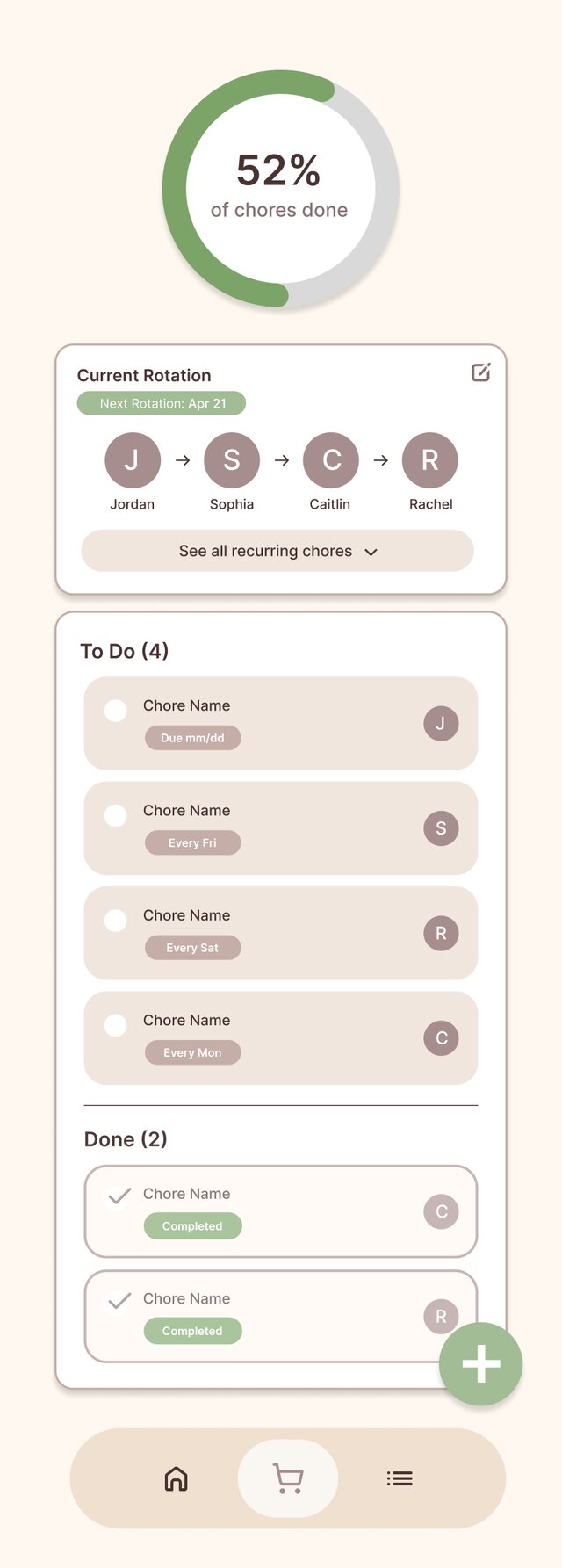
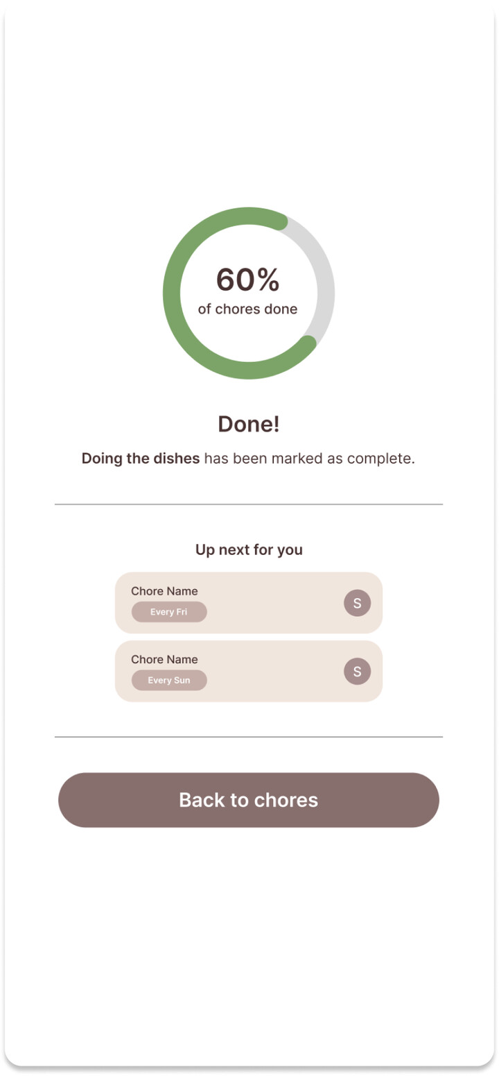
We initially explored an earthy palette of browns, beiges, and greens to evoke warmth and groundedness for our branding, but it read as too literal a take on “home.” We shifted to soft pastel gradients such as blues, oranges, and pinks for a friendlier, more energetic feel that better matched the app's tone.
Initial Color Testing Screens
Final Branding Elements
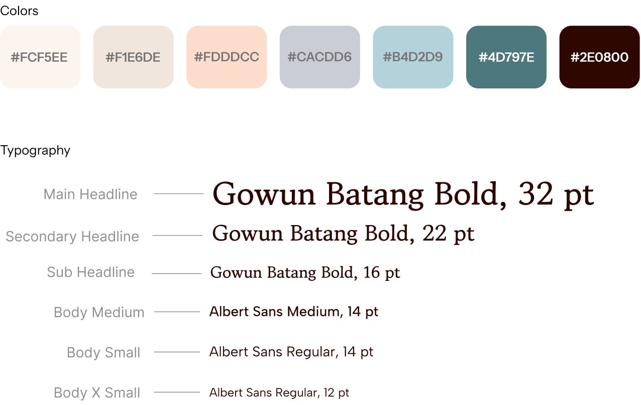
I also created a few illustrations based on the colors and gradients that we chose that were later used for our social media posts and pitch slides.


Final Solution
The chore tracker, screen by screen
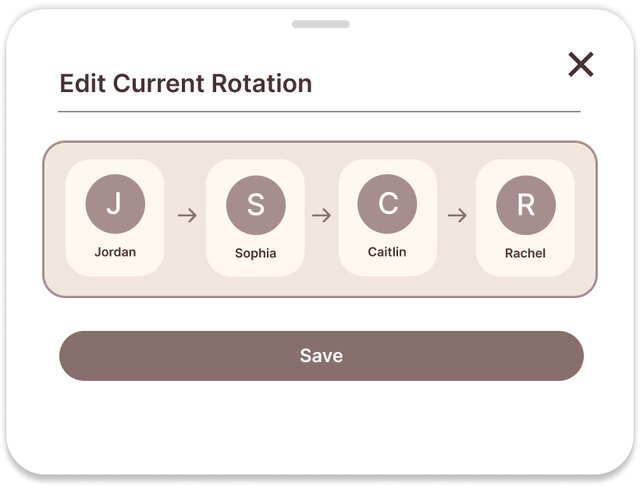
The chore tracker focuses on three main functionalities: creating and editing chores, keeping track of your house's collective progress, and editing chore settings such as current roommate rotation.
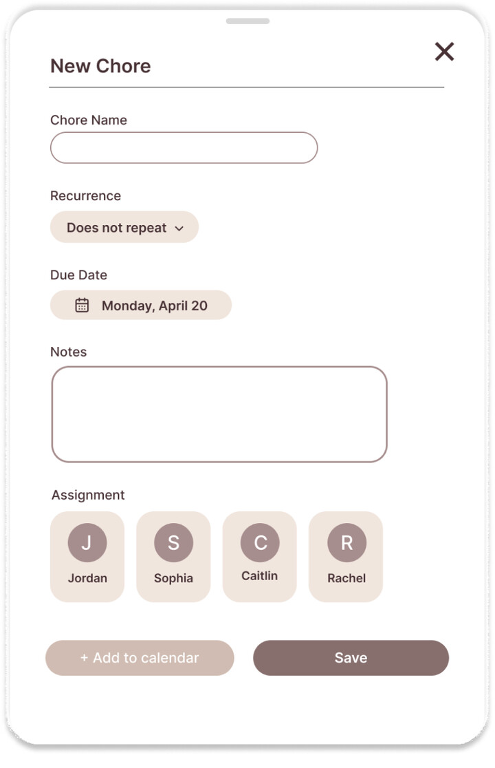
Creating Chores
Add a new chore to your home's shared tracker, complete with a task, deadline, recurrence, and assignee
- Choose a one-time or recurring schedule, with options like daily or weekly repeats
- Add optional notes for extra context on the chore
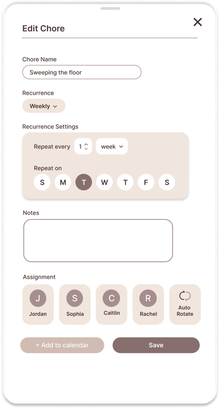
Editing Chores
Update an existing chore in your home's shared tracker as plans change
- Edit any existing chore to update the task, swap the responsible roommate, or adjust the due date
- Changes reflect immediately across the shared tracker for the whole house
Tracking Progress
Check completion progress at a glance with stats at the top of the page, showing how your household is keeping up week to week
- View how many chores have been completed versus what's still pending for the week
- See how many days your house has gone without missing a chore
Chore Settings
Set up your roommate rotation order and view which chores repeat weekly, including any randomized through the weekly scramble
- Arrange the order roommates cycle through for recurring responsibilities
- View a list of all your recurring chores
Reflection
Notes & Takeaways
Homie was my first time designing for mobile, and it pushed me to think differently about scale, hierarchy, and how information gets presented on a smaller screen.
Designing for a
smaller screen
Mobile design turned out to be a lot different from web design in ways I didn't fully expect. Contrast, spacing, and how much information a screen can hold all mattered more once everything had to fit into a much smaller space.
Branding without
being literal
I also learned that branding doesn't need to be literal to feel cohesive. We initially explored an earthy color palette to reflect the mood and feeling of a shared home, but ended up revising it to a pastel gradient approach that felt like a better fit for the app.