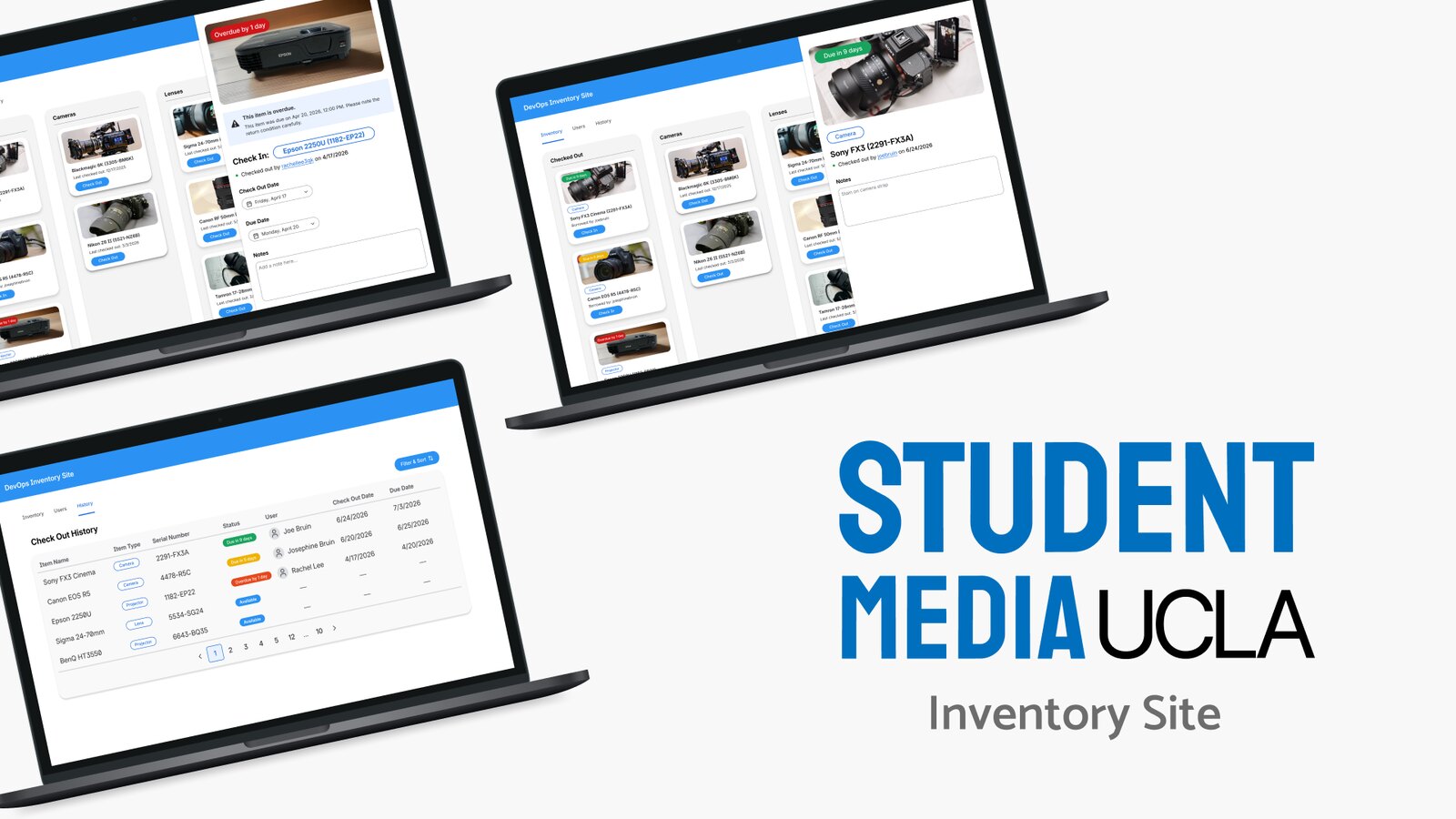
Student Media Inventory Tracker Site
A Kanban-style inventory tracker built for UCLA Student Media to help staff manage check-outs, due dates, and overdue equipment like cameras, lenses, and projectors.
Problem
30 pieces of equipment, and no system keeping track of them.
When I came onto this project, Student Media had no centralized system for managing their equipment. The main issues were:
- 1 No centralized way to track what was checked out or available
- 2 Inconsistent tracking of borrowers and due dates
- 3 No visibility into which items were overdue
- 4 No reliable audit trail for accountability
- 5 Slow, disorganized workflows at the front desk during check-in and check-out
That gap became the starting point for what I designed. The full product vision included admin tools, user management, and an audit system, but my work focused on the core day to day experience: the board itself, item details, and the check-in and check-out process staff would be using constantly.
User Flow
The check-in, check-out cycle
Check-out and check-in ended up being the two flows at the core of this system, and they naturally mirror each other. Checking an item out means assigning it to a borrower and setting a due date, while checking it in means confirming its return and moving it back to its category.
I mapped both flows with the front desk in mind, since staff needed to move through them quickly during busy periods without the system slowing them down.


Low Fidelity Designs
Early Versions
Several rounds of client feedback shaped the final board, and two changes stood out as the most significant. Here's a closer look at each.
Finding the right amount of information for each card took a few rounds. I went back and forth on whether to include the due date, item type, and who the item was currently checked out to, or when it was last checked out.
Early versions tried to fit in most of this at once, which made the board feel cluttered and harder to scan quickly. I ended up paring it down to what staff needed at a glance, keeping the rest available in the click-through view instead.
Item Card Iterations
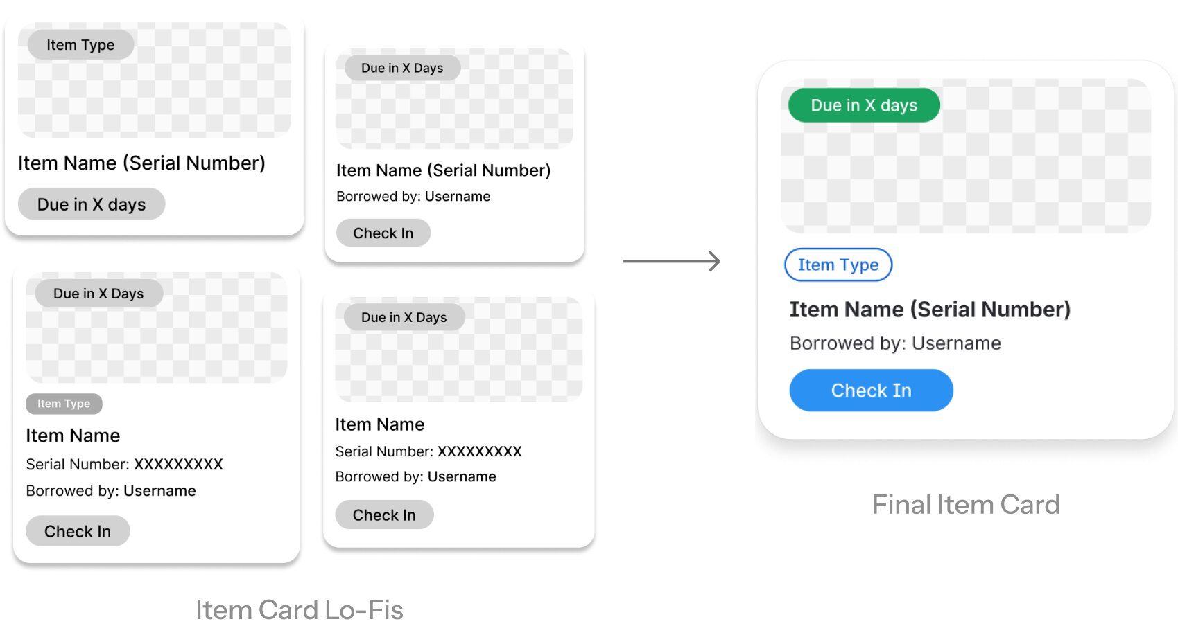
One of the earlier changes was adding a check-in and check-out button directly onto the item card in the main board. In the first version, staff had to click into a card and navigate somewhere else before they could take action, which added a step to something that needed to happen constantly throughout the day. Moving that button onto the card itself let staff check items in and out without ever leaving the board.
I also tested a few different layouts for the panel that opens when a card is clicked, including a full popup, a sidebar, and a side popup that combined pieces of both. The sidebar ended up being the better fit. It was large enough to show the details staff needed without feeling cramped, and unlike a full popup, it let people keep an eye on the rest of the kanban board while it was open, which made moving between items faster.
Item Card Pop-Up Iterations
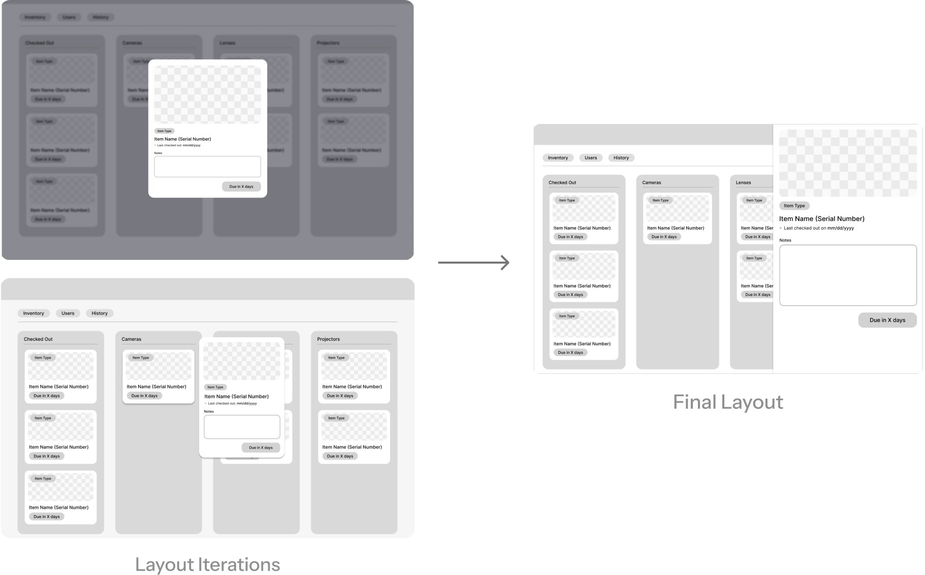
Final Solution
Final Designs
The final product brings the full check-in and check-out cycle onto one board, letting staff manage equipment status at a glance. Below are a few of the core interactions in action.
Item Check-Out
Select an available item from the board, assign it to a borrower, set a due date, and watch it move into the checked out column.
Item Check-In
Select a checked out item, confirm its return, and add optional condition notes before it moves back to its category.
Borrowing History
Scroll through a running table of recent activity, showing which items were checked in or out, who was involved, and when.
Reflection
Notes & Takeaways
Working on this project taught me a few things I hadn't really thought about before, mostly around what actually makes a design successful. Not every project needs to solve for visual polish, and sometimes the right instincts don't look the way you'd expect.
Function over
visual polish
Not every project needs to be visually beautiful or have a strong design system behind it. This one was about making someone's job easier in a real, practical way, and that mattered a lot more than a cohesive color palette or visual brand.
Convenience over
visual cleanliness
What looks like clutter at first can actually be the right call. Adding the check-in and check-out button directly onto each item card seemed like it might crowd the design, but it ended up saving staff real time and made the board more useful in practice.