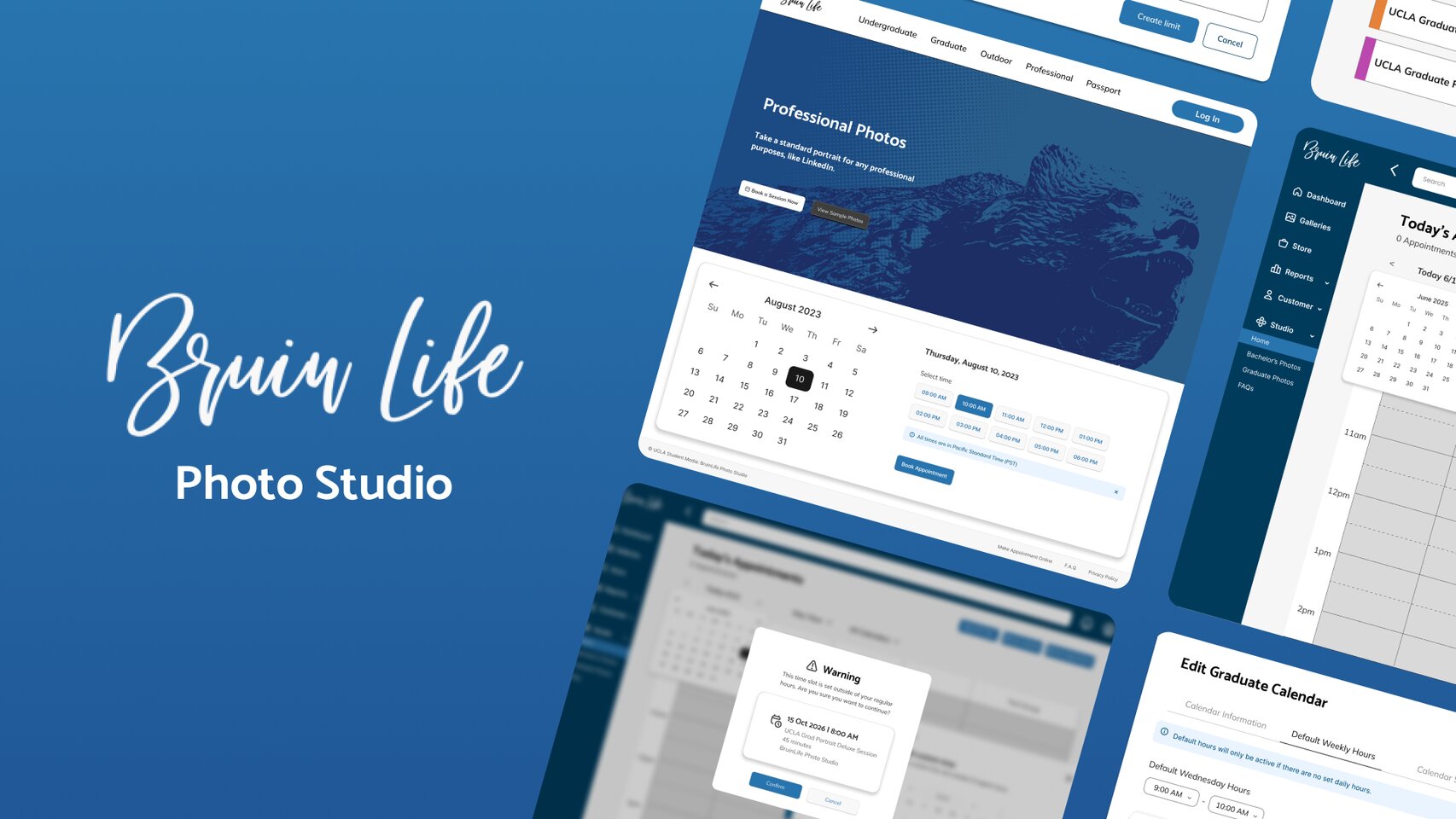
BruinLife Photo Studio
A web platform for UCLA's photo studio where students book graduation portrait sessions, view proofs, and select yearbook photos — streamlined for both students and studio managers.
Problem
Booking a graduation portrait shouldn't be this complicated.
At the time, the BruinLife photo studio site managed the full graduation portrait pipeline from booking to proofs to yearbook selection, but it lacked a cohesive, intuitive experience for both students and studio managers in one platform. The redesign aimed to bring both sides of the platform under one unified, intuitive experience. I joined mid-project at the hi-fi stage, designing screens across the customer-facing booking flow and internal management tools.
Print package management is split across costly third-party tools for admins and a disjointed checkout experience for customers — making it hard for admins to control gallery pricing and for customers to go from viewing proofs to placing an order.
Build an integrated system where admins can manage pricing and packages directly within each gallery, and customers have a single, guided flow to view photos, select favorites, and check out.
Current Solution
Before the redesign: Acuity Scheduling
The studio was previously managing appointments through Acuity Scheduling, a third-party tool that lived outside the studio's own platform. Built as a general scheduling tool, it wasn't designed to accommodate the studio's specific work structure. For example, whenever a holiday or schedule exception came up, managers had to create an entirely new calendar to accommodate it rather than using a simple global setting, resulting in a cluttered system of one-off calendars that was hard to manage at scale. Part of my role was to adapt the familiar Acuity Scheduling interface and flow into the studio's website while addressing the pain points managers were running into and aligning it with the studio's specific needs.
Visual Identity
Design System
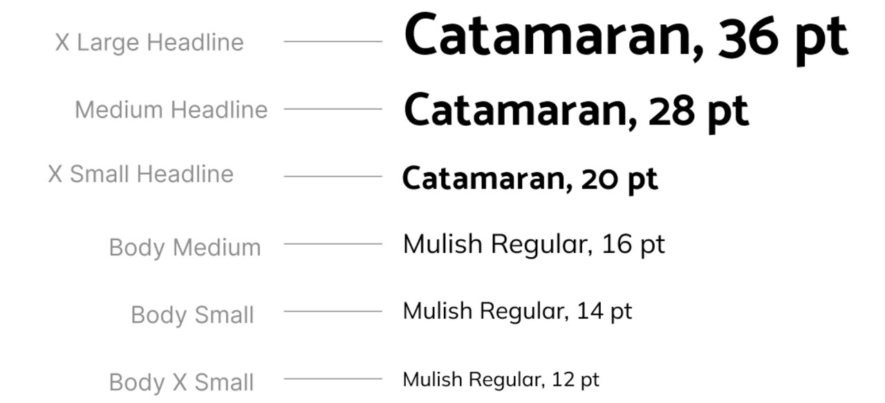
For all my hi-fis, I worked within the already established BruinLife branding, making sure the colors, typography, and visual style were consistent across screens.
The design system for this project specifically included the BruinLife colors and typography, the Polaris icon and component design libraries, and accompanying visuals such as the BruinLife logo and official UCLA bruin graphics.
Design System Elements
Colors
Typography
Final Solution
The redesigned experience
The screens below cover two core flows — one for students booking a portrait session, and one for studio managers handling appointments internally.
Customer-Facing Appointment Booking
Sign in, land on the booking page, and select a session date and time — with a confirmation pop-up at the end to save the appointment directly to your personal calendar.
Internal-Facing Appointment Booking
Select a user, choose a calendar type, pick a date and time, and confirm to book the appointment.
Appointment Management
View appointment details, create new sessions, reschedule, and pull up a client's appointment history — all from pop-ups within the internal calendar.
Additional Screens
Resource Limits
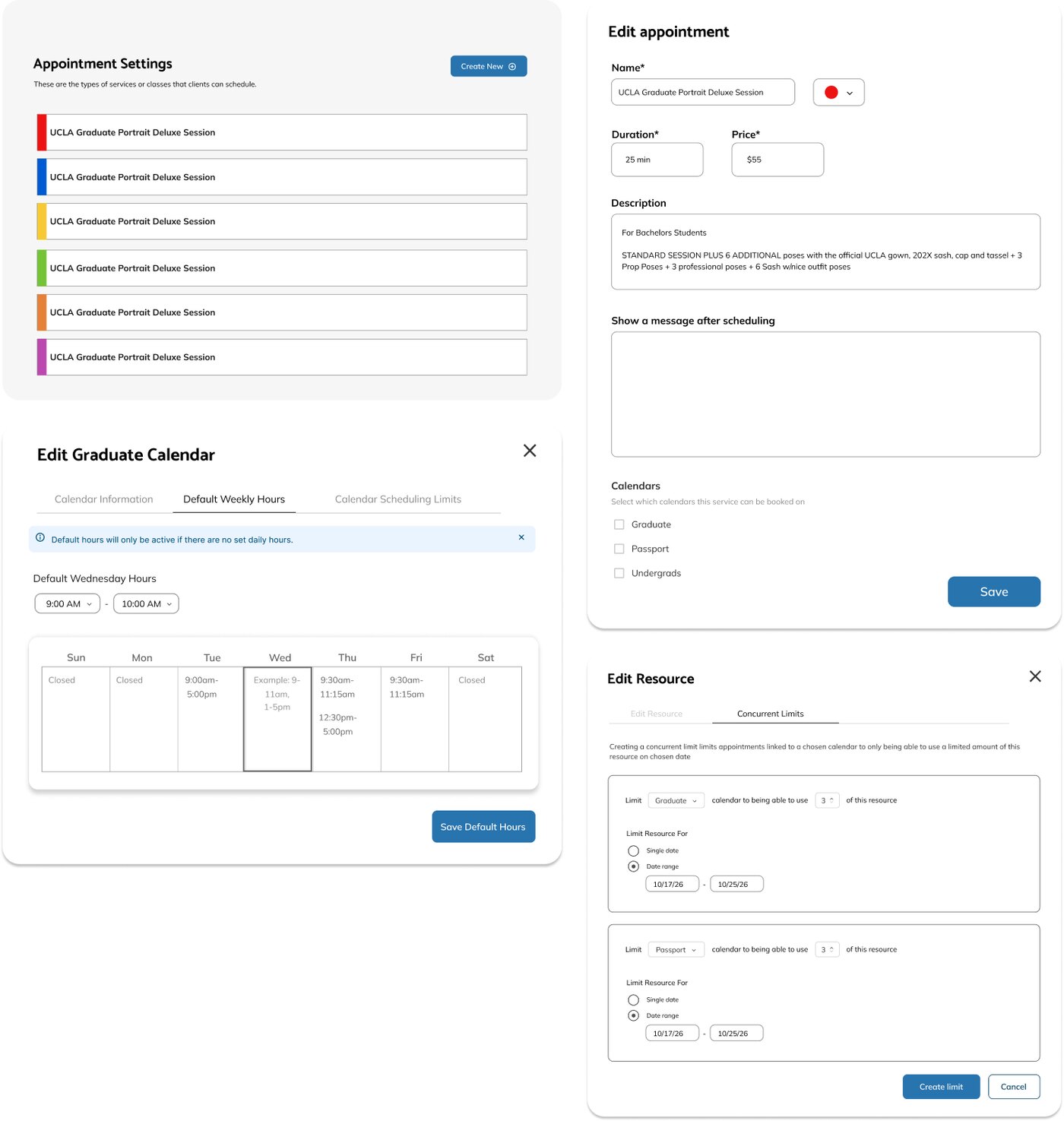
I also collaborated with another designer to design the resource limit functionality. This tracks how many cameras, shoot rooms, and other resources are available across multiple shoot appointments occurring at the same time. Below are the screens I made.
Reflection
Notes & Takeaways
Since this project was a different experience than my others, it pushed me to design with more restrictions and specificity than I was used to.
Joining
mid-process
Joining at the hi-fi stage meant doing my own research on the BruinLife brand and asking a lot of questions about the existing appointment process upfront. This paid off in fewer redesigns down the line.
Designing
for a client
Without a UX research phase, I had to be more intentional about every design decision and rely heavily on client feedback to make sure the flows were accurate to their specific needs.