“I Wish You Love” Songbook
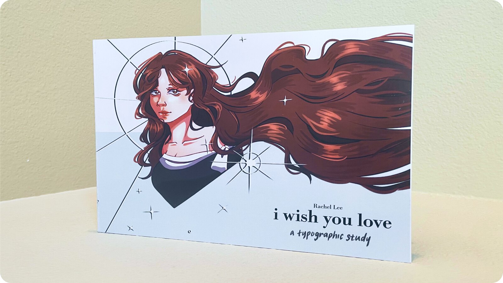
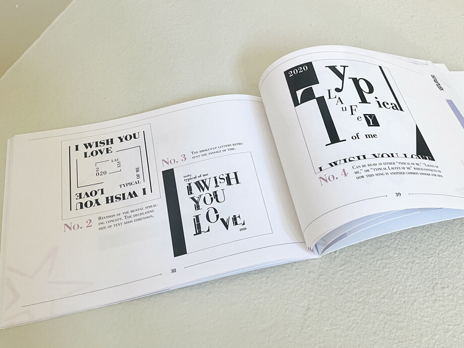
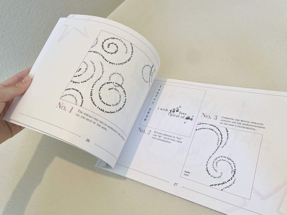
A 72-page songbook featuring 32 typographic album covers created with the Bodoni typeface based on Laufey's song, "I Wish You Love."
Overview
"I Wish You Love": A Typographic Study
Over the course of 10 weeks, I designed 32 album covers based on Laufey's "I Wish You Love" and compiled them into a single, cohesive songbook. The project included:
- 1 32 album cover designs
- 2 Book layout and sequencing
- 3 The perfect-bound songbook (10.5 x 7.75 in)
- 4 A typography animation
The designs progress in complexity throughout — starting with simple black and white single-sized type and building toward pieces that combine text, illustration, and treated imagery.
The Song
The inspiration behind the project
Laufey wrote "I Wish You Love" about wishing the best for someone who is no longer in her life. The song sits in a bittersweet space between reminiscing and moving on and what makes it stand out is that it captures the end of a relationship on good terms, with no conflict or resentment left between the two people.
Design Direction
How the design reflects the song
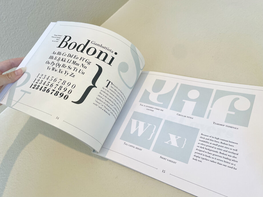
All 32 covers use Bodoni, a typeface that is simple and elegant without feeling cold or distant. I chose it because it mirrors the experience the song describes, as something that seems straightforward on the surface but carries a quiet complexity underneath.
Soft colors and restrained layouts carry that same feeling throughout the book, reflecting the grace and honesty of the song without overpowering it. These soft colors also tie into Laufey's branding, as I wanted the book to also capture her identity as an artist.
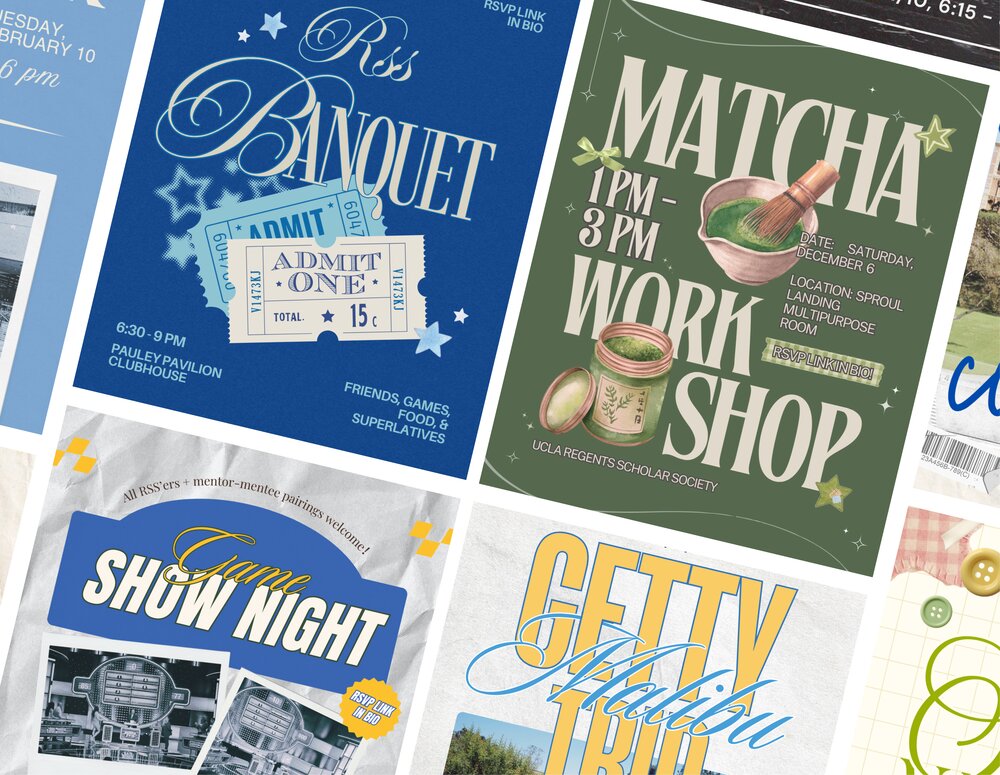
In terms of style, I wanted the book to feel handmade and elegant at the same time. The personal, emotional nature of the song reminded me of a journal or scrapbook, which I used as a visual reference, but I still wanted to retain the polish and sophistication that Bodoni brings. The final designs sit somewhere between the two, balancing warmth and refinement without leaning too far in either direction.
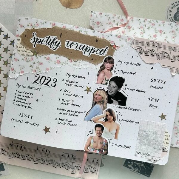
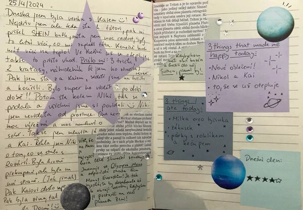
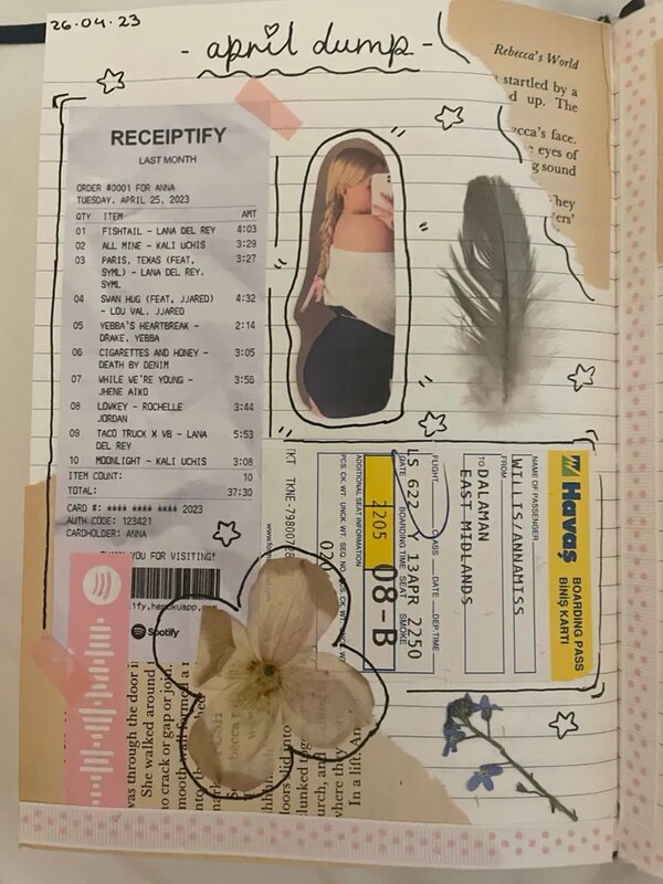
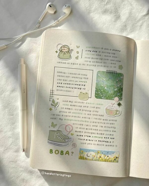
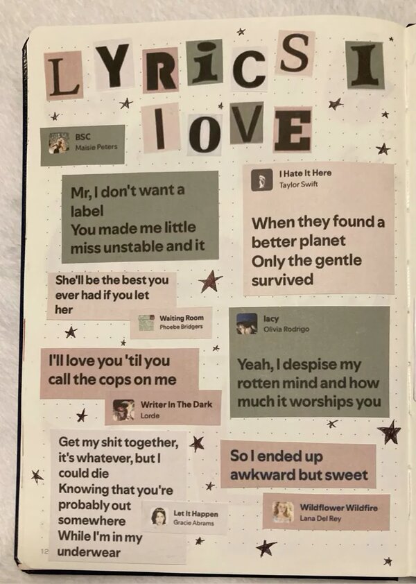
Scrapbook and journal inspiration board
Album Cover Designs
The same song, 32 times
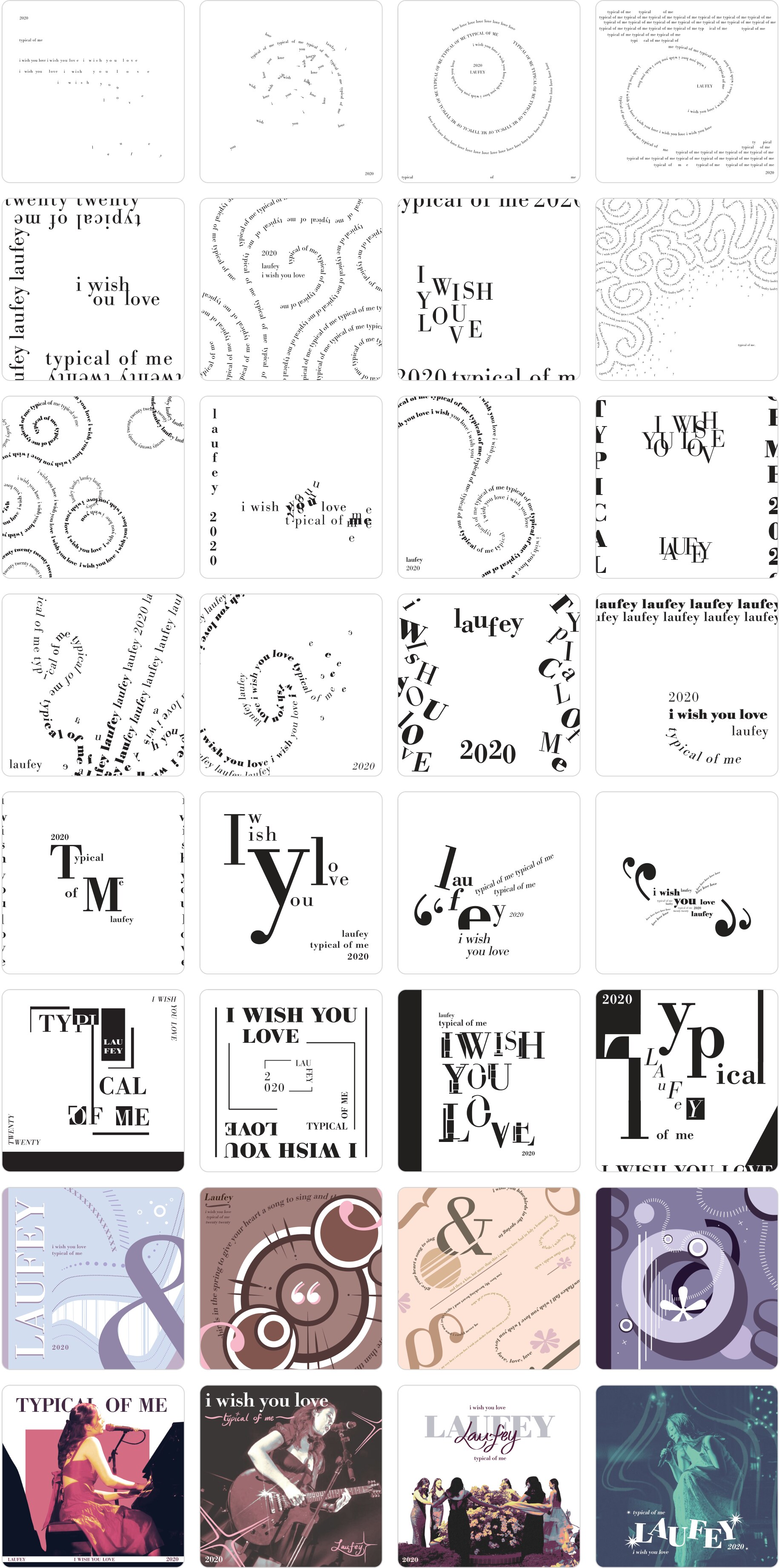
The 32 covers progress in complexity throughout the book, opening with minimal black and white compositions using a single font size, and gradually incorporating illustration, treated imagery, and layered type by the end. With each cover, I explored a different angle or emotion present in the song. I used composition, scale, color, and repetition as the primary tools for conveying those ideas.
Book Layout
Sequencing the covers into a story
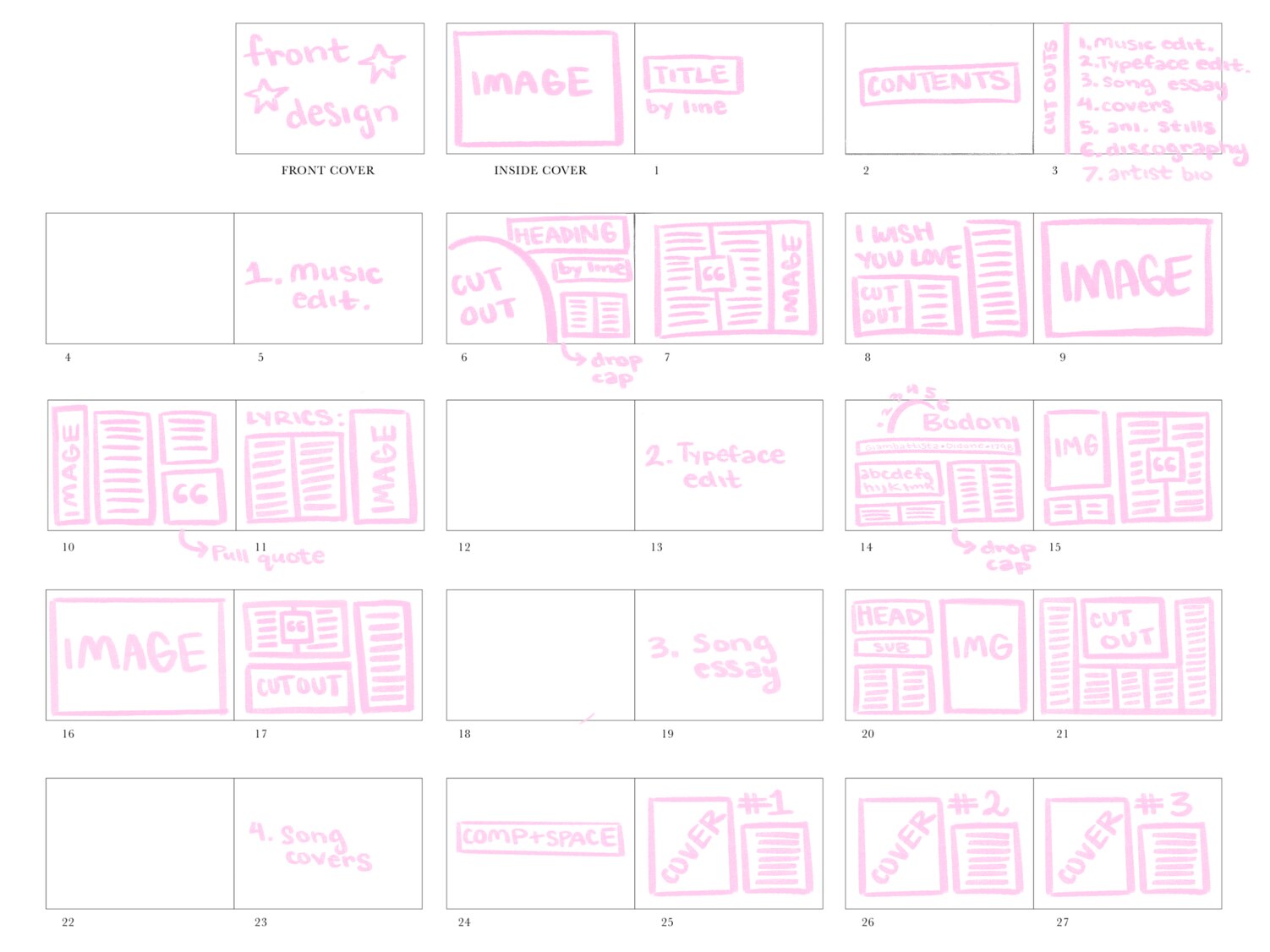
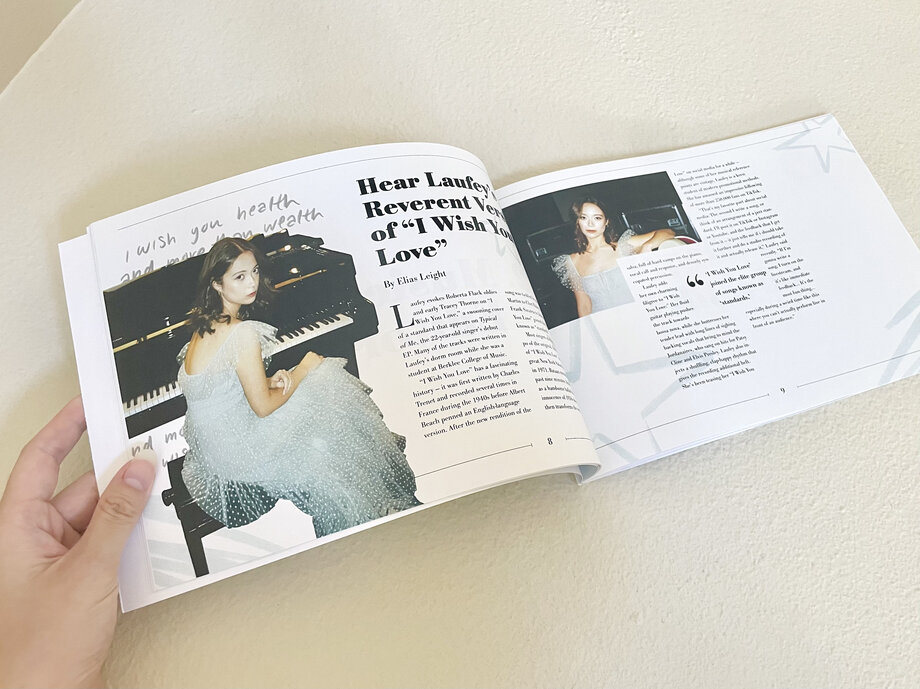
The covers are sandwiched between front and back matter which include essays on Laufey, the history of Bodoni, and the song itself. The sequencing prioritizes full-bleed imagery and visual spreads over dense text. The goal was for the book to read less like a document and more like a narrative that echoes the emotional arc of the lyrics.
Physical Book
From screen to print
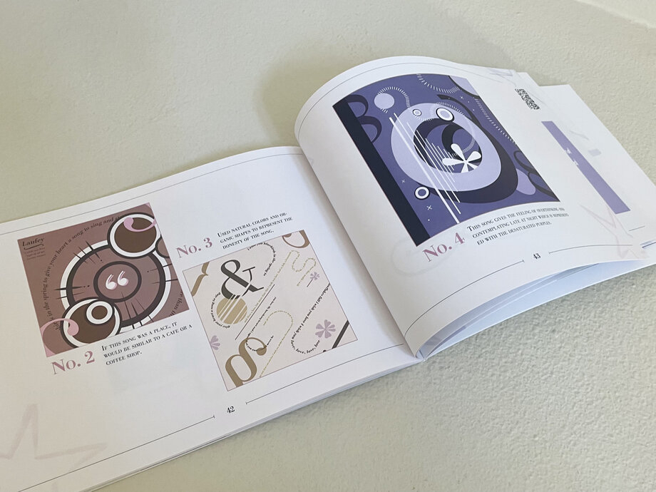
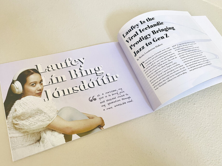
After finalizing the layouts digitally, I printed the book on ultra-smooth, bright white 32 lb paper and assembled it myself using a perfect binding machine. The paper's weight and surface quality were important to me as the clean, crisp finish complemented the elegance of the designs and helped the soft colors and Bodoni type come through as intended.
Full Songbook
The complete book, cover to cover
The full songbook is available to read below.
Typography Animation
A motion interpretation
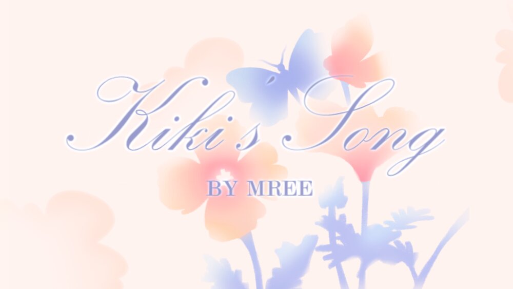
Taking inspiration from one of my favorite album cover designs, I also created a typography animation for the song using moving text and hand-drawn 2D illustration.
Reflection
Notes & Takeaways
This was the first time I worked in typographic design this extensively, and it pushed me to think about type in a much more technical way than I had before.
Getting to know
a typeface
Making the album covers themselves was the part I was least familiar with going in. I got to know the Bodoni typeface closely, which gave me a better framework for analyzing other typefaces beyond just this project.
Designing around type,
not just with it
I learned about typography anatomy and terminology on a technical level, but also had to learn how to design around a typeface rather than just place it. Those turned out to be two different skills entirely.